The Alabama Biscuit Company
Jonathan Burch set out to make a better biscuit for his family.
Unable to find one made with healthy, locally grown sprouted grains, he put his landscape business on hold and started making them himself.
Launched in 2013, Alabama Biscuit has grown from a single location in Cahaba Heights into a Birmingham institution with multiple locations.
Birmingham, Ala.
2013 - Present


Inspiration
The identity begins with one of Alabama's most recognizable symbols: the St. Andrew's cross of the state flag.
Rather than reproduce the flag literally, we abstracted its geometry into a distinctive graphic system—one that connects the brand to Alabama while giving the Biscuit Company a visual identity of its own.
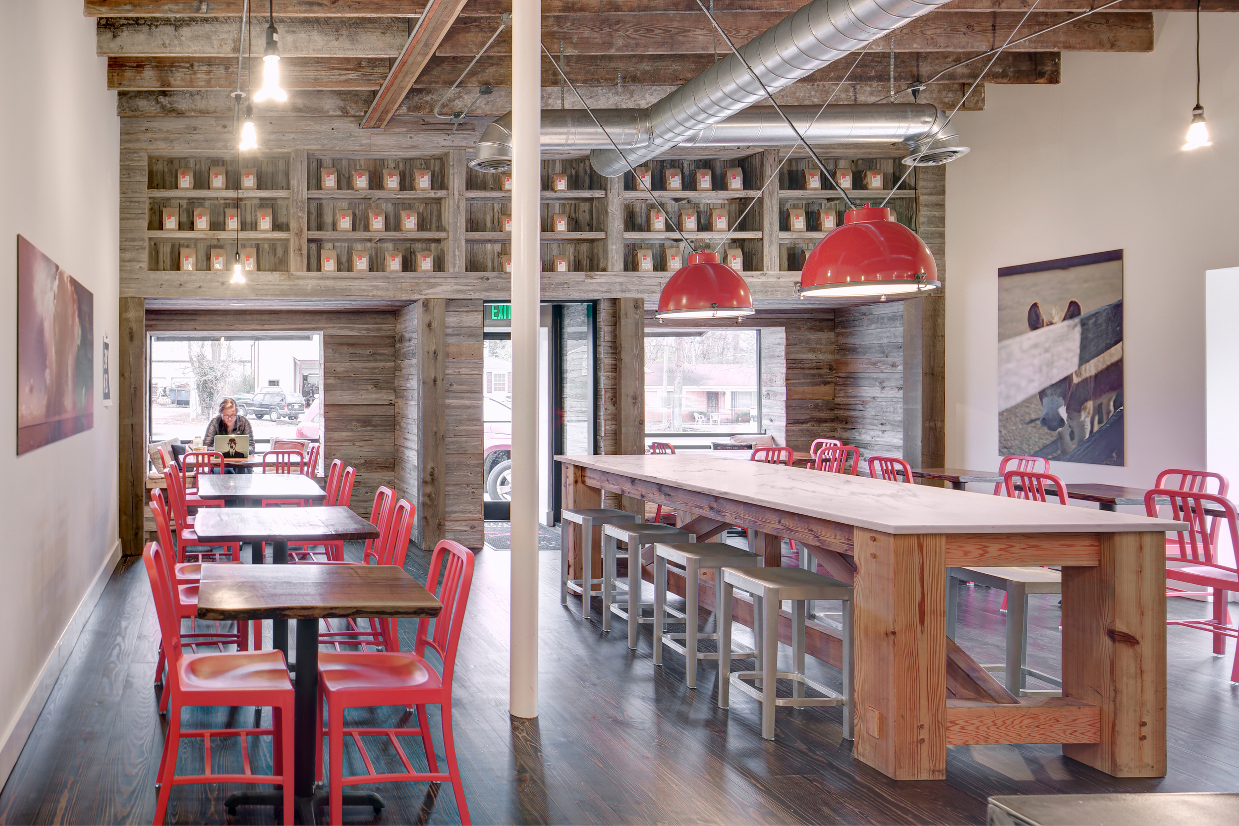
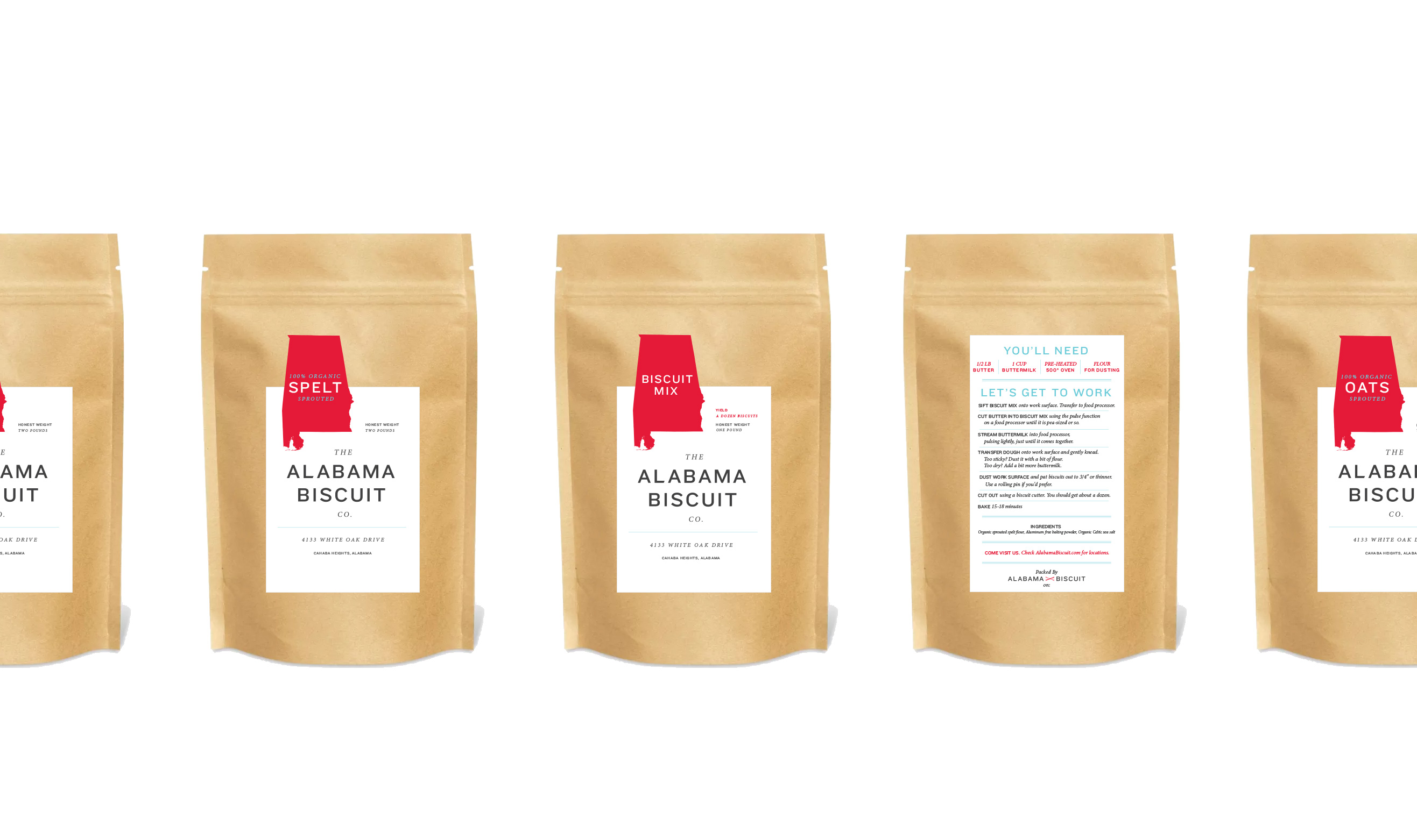
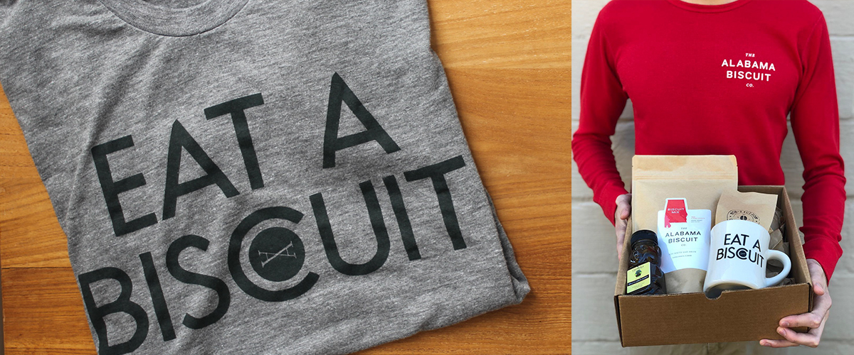
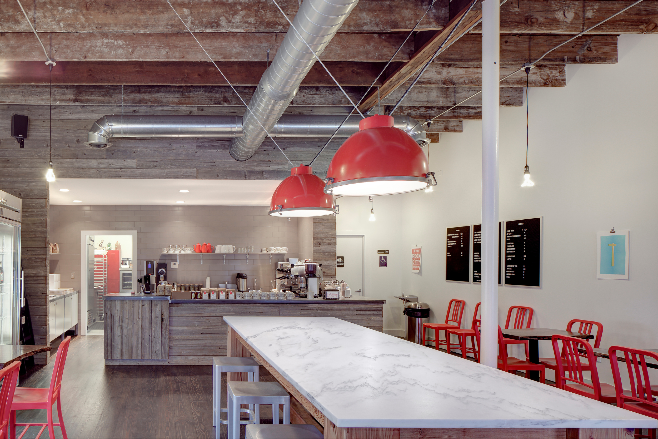
The identity carries that geometry across the brand's physical environment, packaging, merchandise, and communications.
The result is direct, recognizable, and deeply tied to place without leaning on the expected visual clichés of Southern food.
Rather than reproduce the flag literally, we abstracted its geometry into a distinctive graphic system—one that connects the brand to Alabama while giving the Biscuit Company a visual identity of its own.
The Brand
The identity carries that geometry across the brand's physical environment, packaging, merchandise, and communications.
The result is direct, recognizable, and deeply tied to place without leaning on the expected visual clichés of Southern food.
Code 1896, §3751; Code 1907, §2058; Code 1923, §2995; Code 1940, T. 55, §5.



Mug Shots
A simple piece of merchandise became an unexpectedly effective brand ambassador.
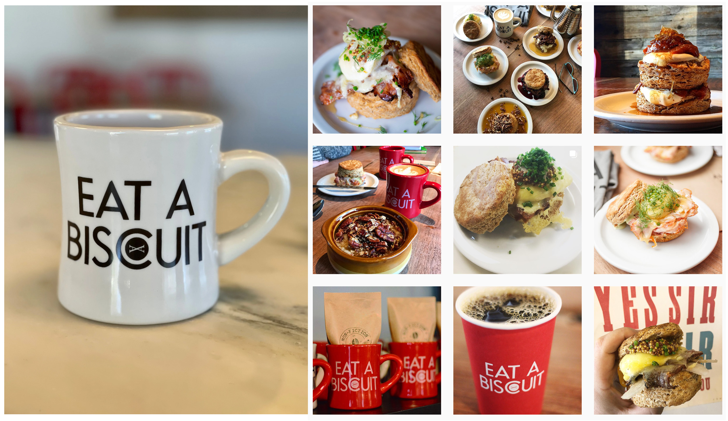
The Alabama Biscuit mug was designed as an object people would actually want to photograph and share. It has since appeared in roughly 65% of the brand's social posts.
Sometimes the best brand touchpoints are the ones people take home.
The Alabama Biscuit mug was designed as an object people would actually want to photograph and share. It has since appeared in roughly 65% of the brand's social posts.
Sometimes the best brand touchpoints are the ones people take home.
A final word from the client:
Watching Micah do design things is like watching Eric Liddell run in Chariots of Fire. A rare blend of humility and confidence leading to a finesse which can only be described as the real deal.
He’s done several projects for me and always under promises and over delivers.
He’s done several projects for me and always under promises and over delivers.
▞▞▞