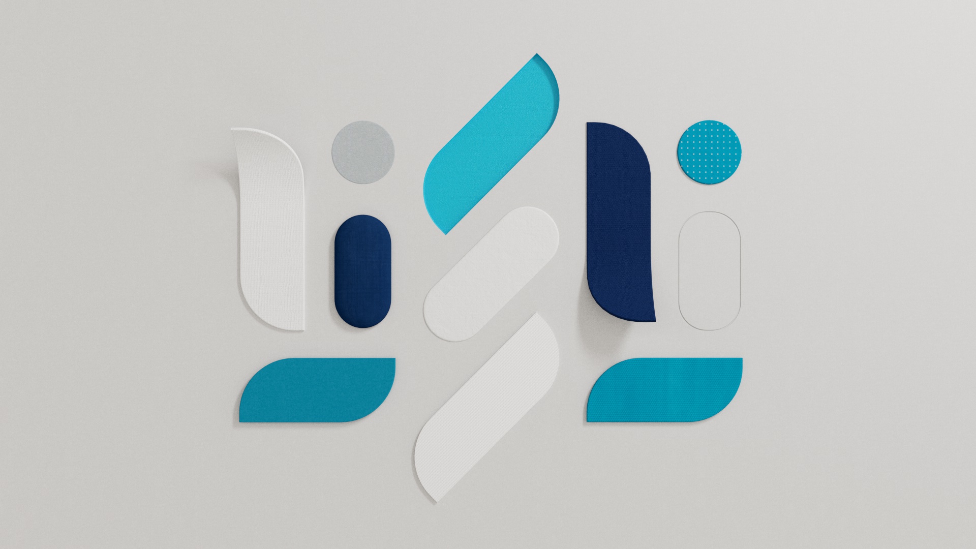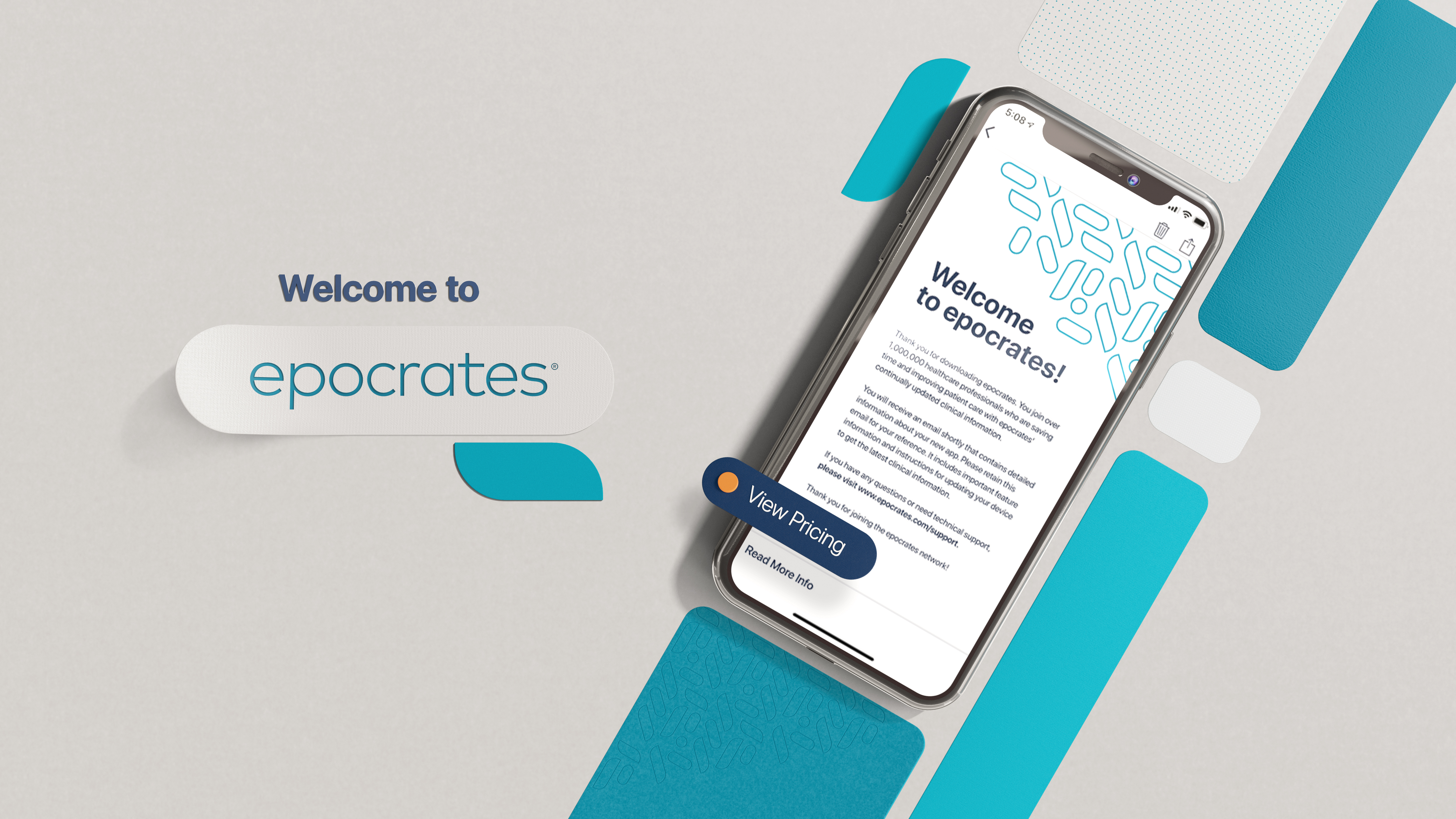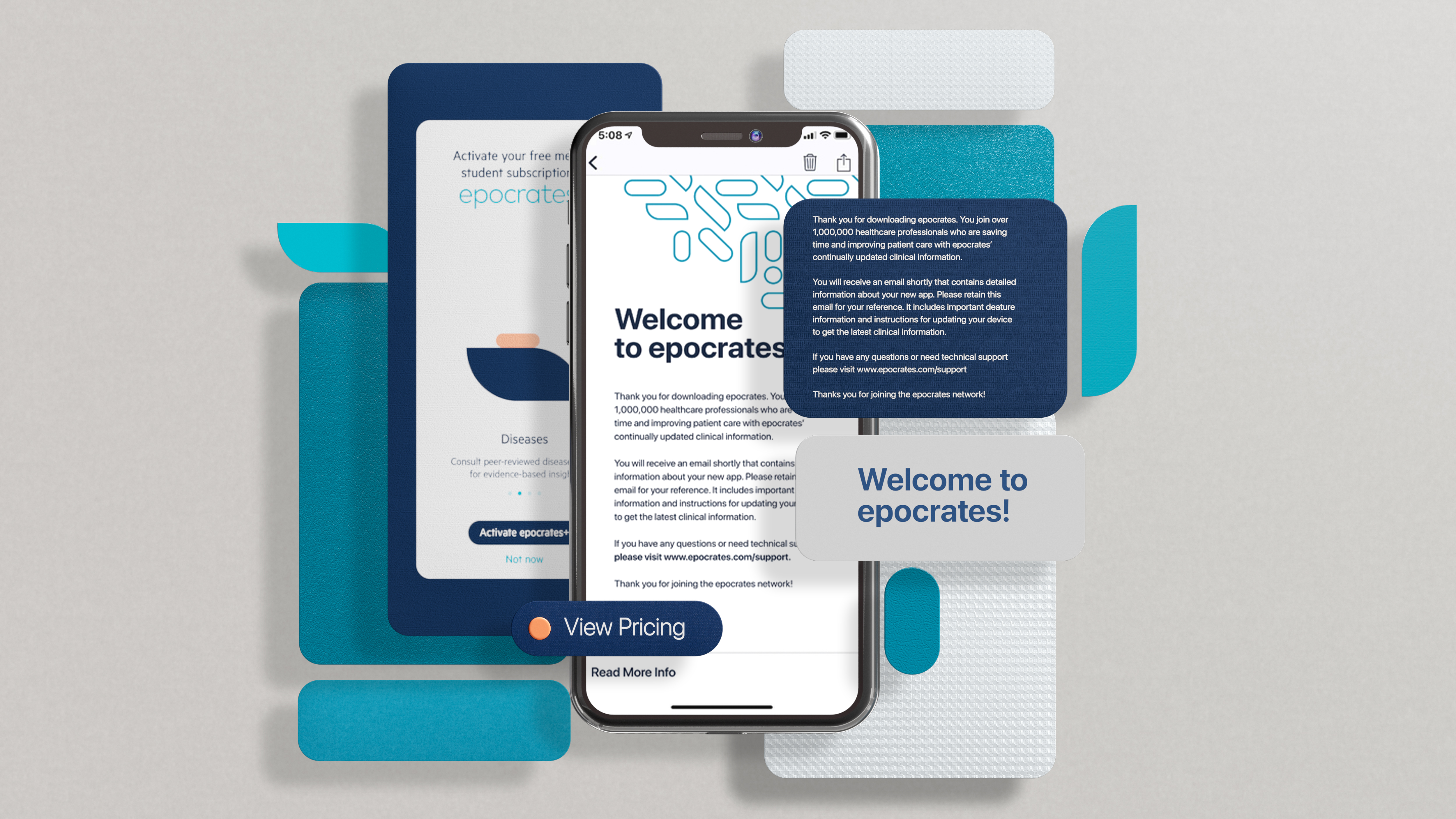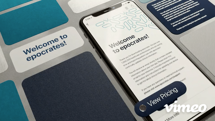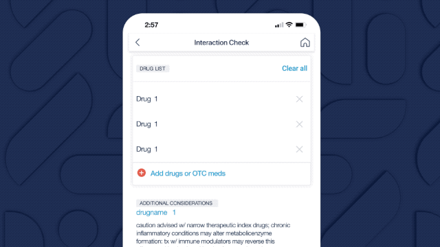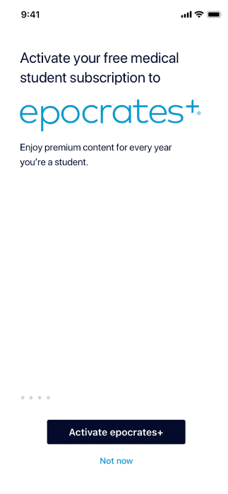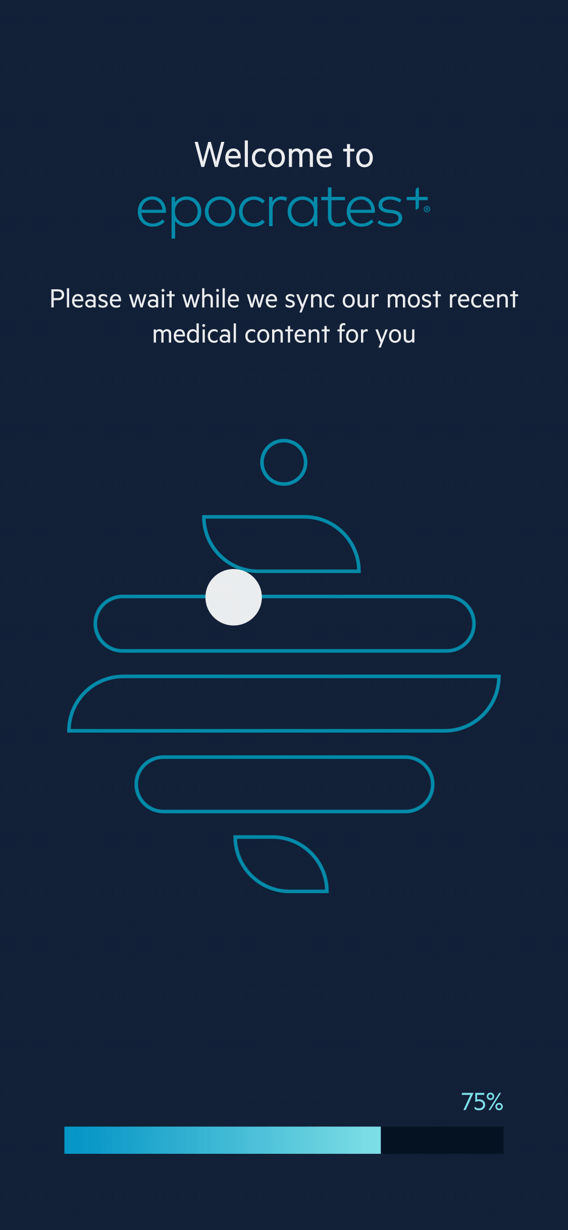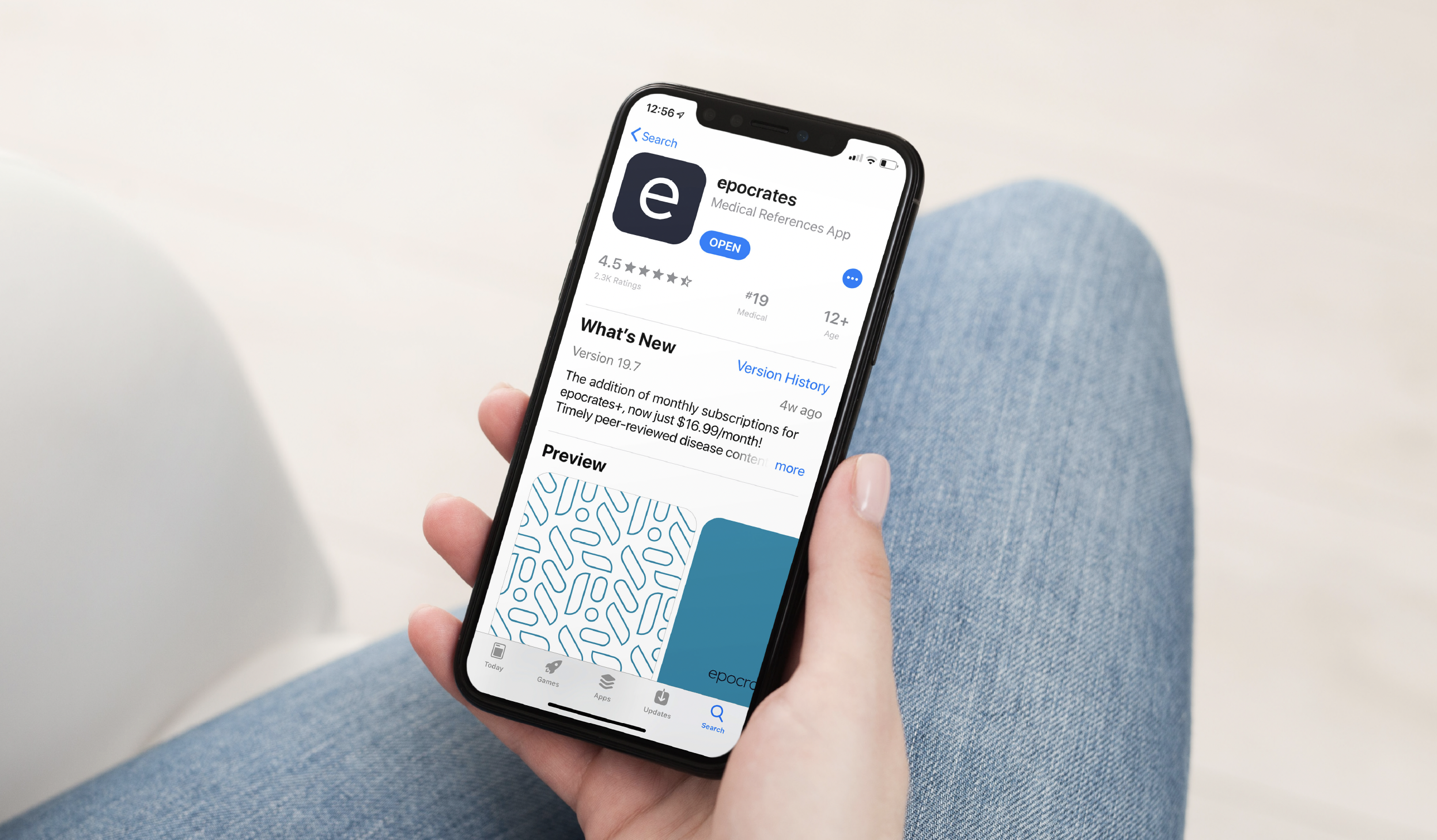
We had the opportunity to redesign epocrates, the #1 medical referece app in the world. We’d developed a sophistiscated color and typography system, paying special attention to motion language.
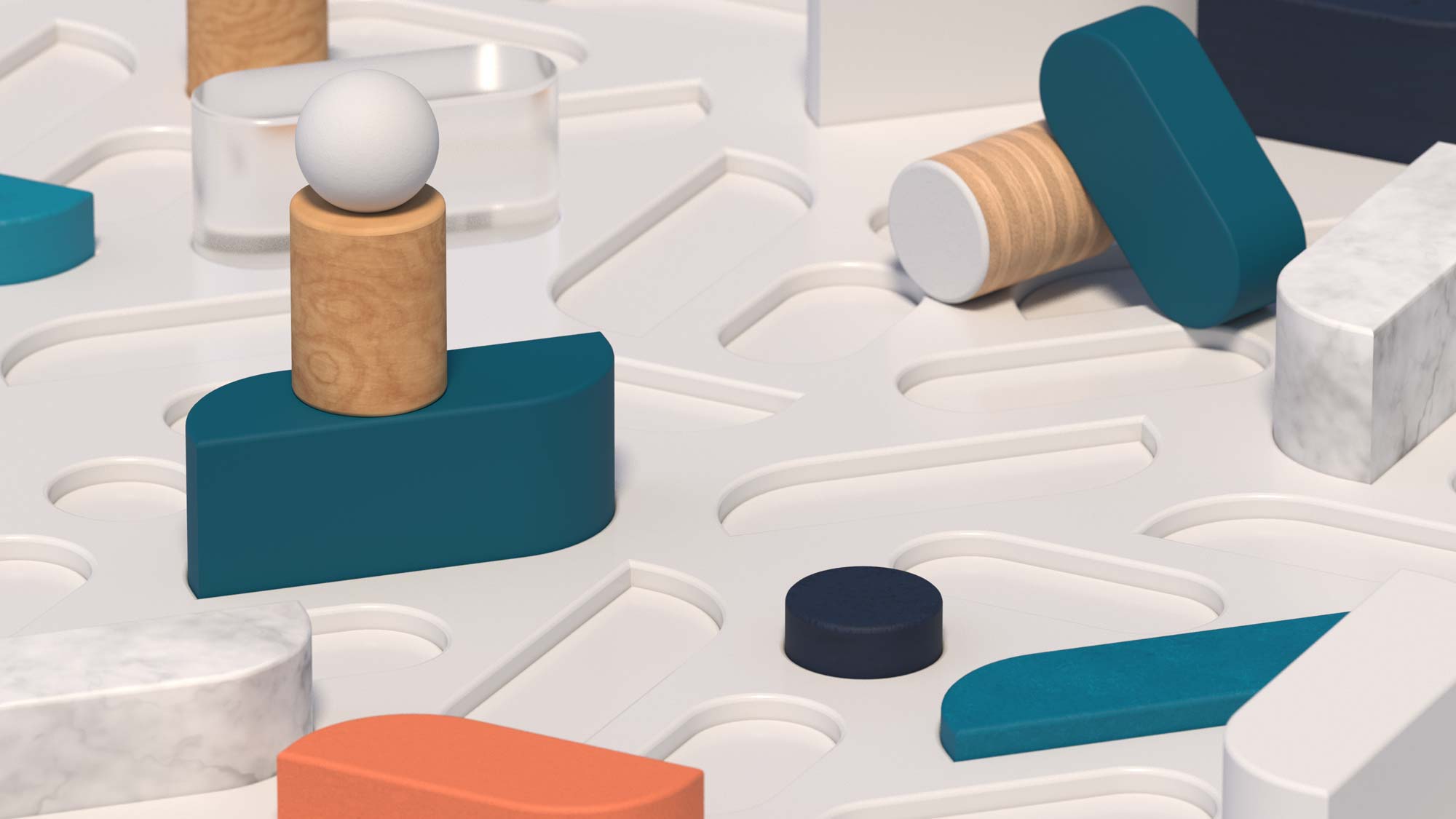
The idea came from the pharmaceutical reference guides – huge volumes of paper that are updated frequently with the latest guidance. Physicians would recognize the warmth of the material; a nod to the days before everything went digital. The color provided warmth as a counterpoint to the bright white light of the operating room. The overall lighting is diffused, a bit of soft rest in an otherwise hectic environment.