
Old Try
Started a company and made 10 Southern art prints.
Grew to over 450 SKUs, built wholesale relationships at dozens of companies, generated $2MM in revenue, and featured in the New York Times, Atlanta Journal Constitution, Garden & Gun, Southern Living, Huffington Post, NPR, Boston Magazine, Mississippi Magazine, Charlotte Business Journal, Design Sponge, and Apartment Therapy.
Created collaboration and custom prints for Garden & Gun, the Southeastern Conference, Duke's, Charleston Waterkeeper, Criquet, Butler Pitch & Putt, Laurel Mercantile (Erin & Ben Napier's shop) & Graduate Hotels.
Sold in 2023 and now just a big fan.
Started a company and made 10 Southern art prints.
Grew to over 450 SKUs, built wholesale relationships at dozens of companies, generated $2MM in revenue, and featured in the New York Times, Atlanta Journal Constitution, Garden & Gun, Southern Living, Huffington Post, NPR, Boston Magazine, Mississippi Magazine, Charlotte Business Journal, Design Sponge, and Apartment Therapy.
Created collaboration and custom prints for Garden & Gun, the Southeastern Conference, Duke's, Charleston Waterkeeper, Criquet, Butler Pitch & Putt, Laurel Mercantile (Erin & Ben Napier's shop) & Graduate Hotels.
Sold in 2023 and now just a big fan.
Boston, MA
2011-2023

Inspiration
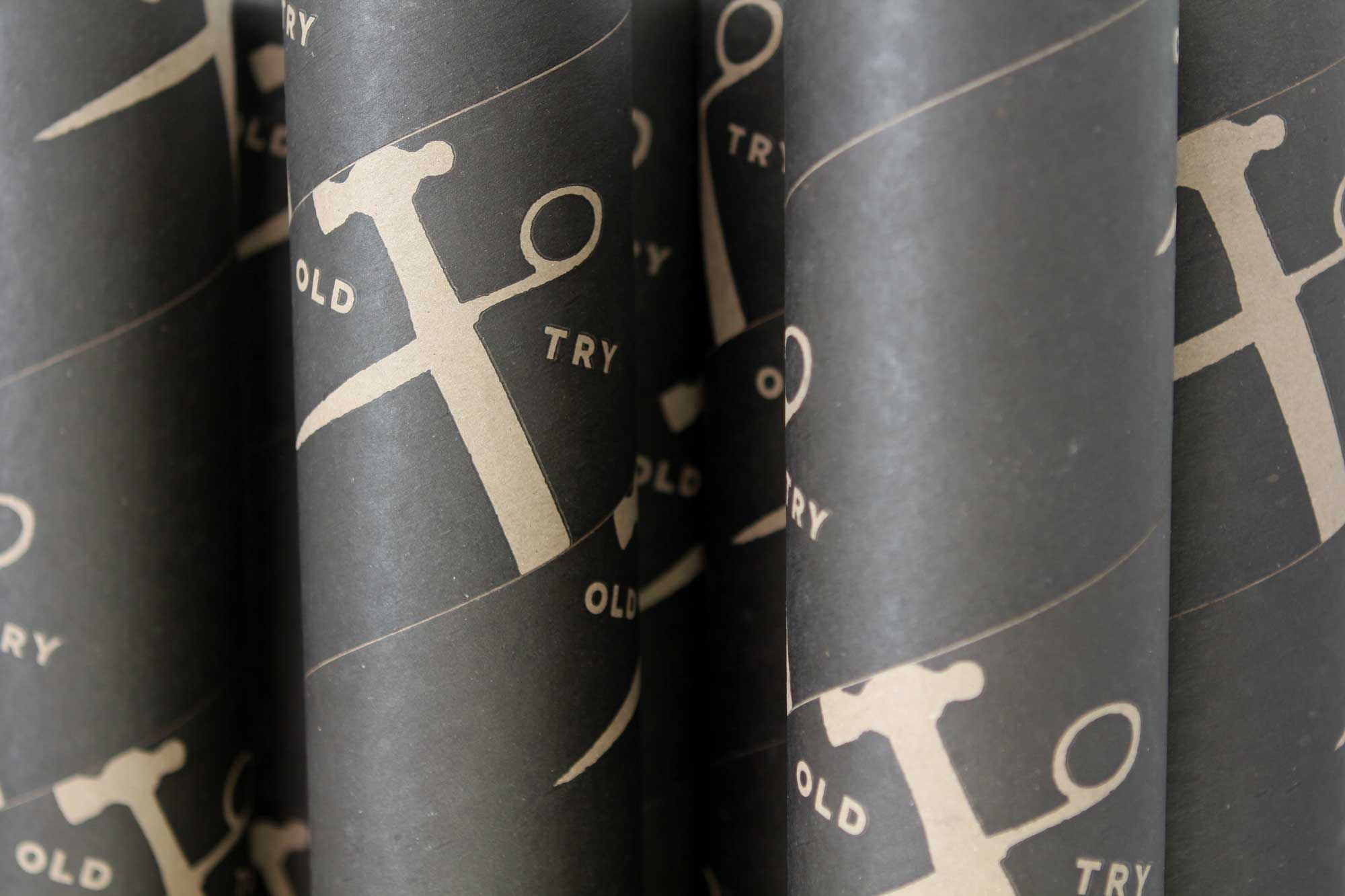
The logo comes the hammer for The Yellowhammer State (my homestate of Alabama), and the scissors in honor of the textile history of North Carolina (where I met my wife).

Execution Notes
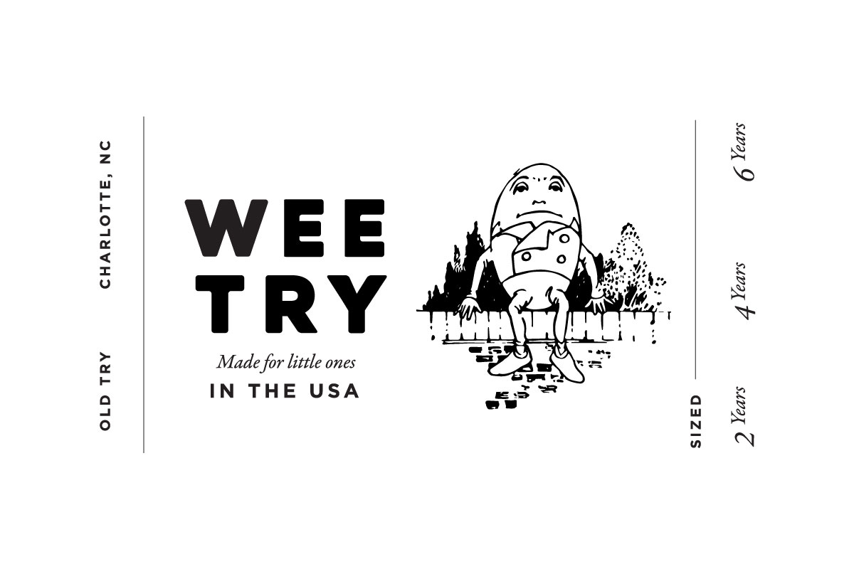
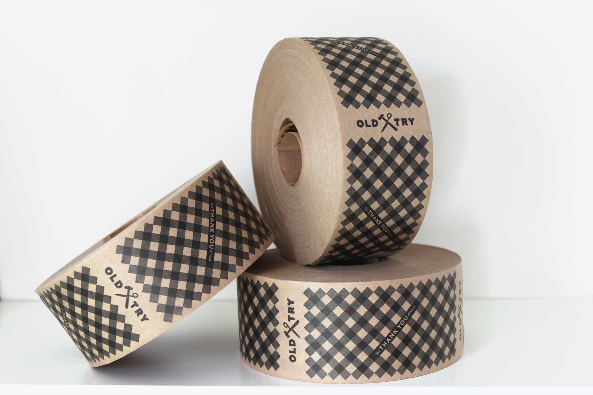
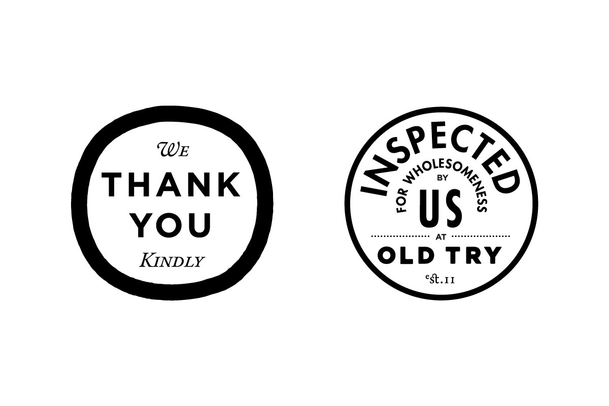
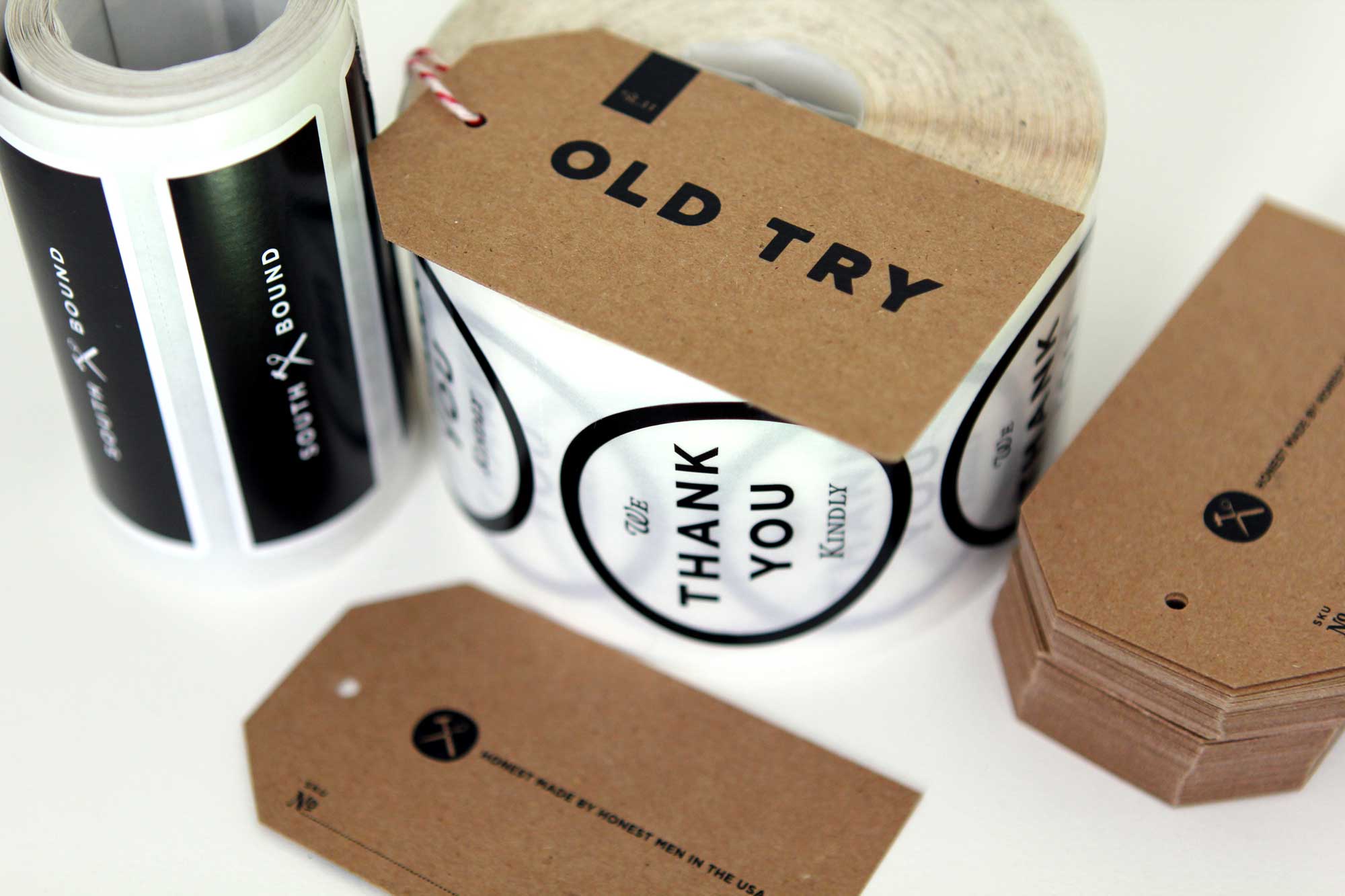
Over twelve years, we did a lots of brand collateral design. A few bits shown.



Main Product Line
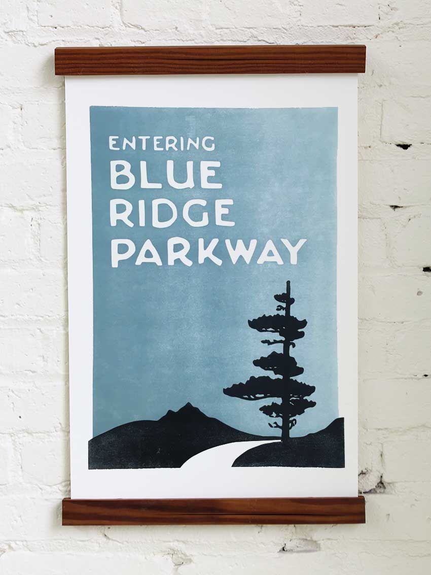
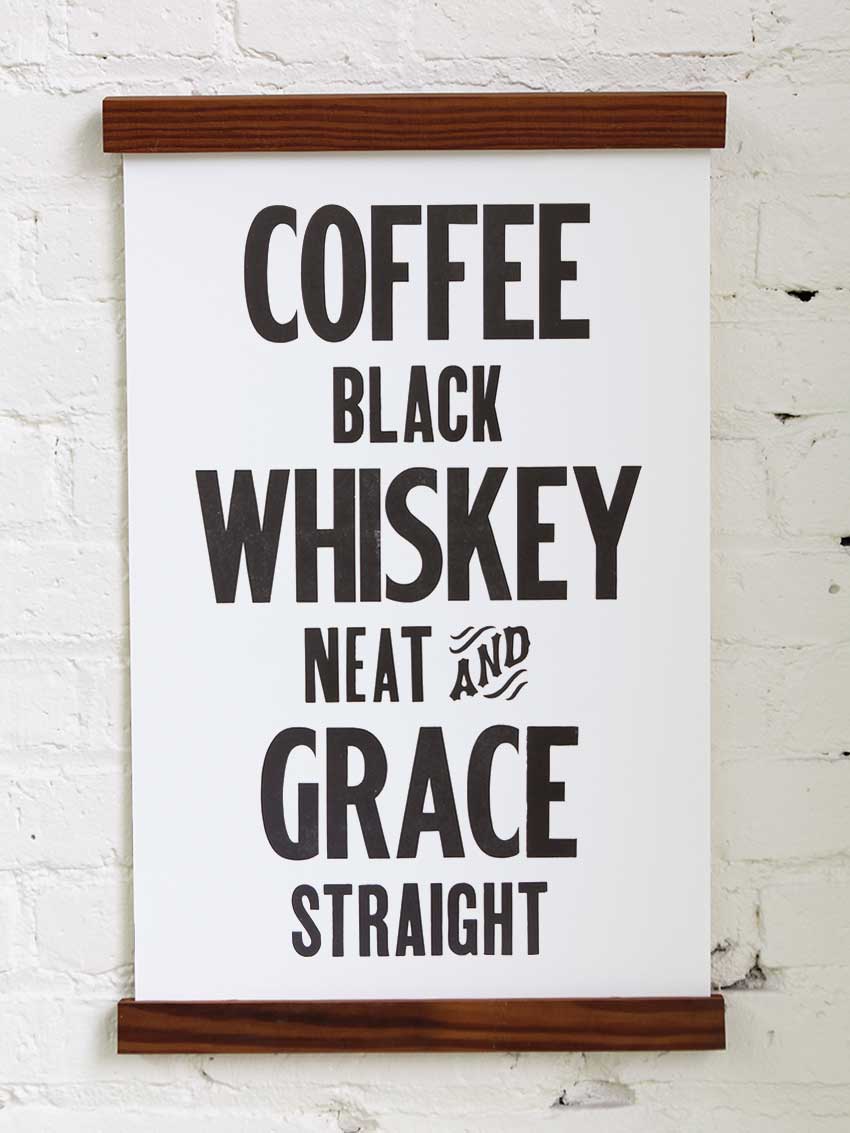
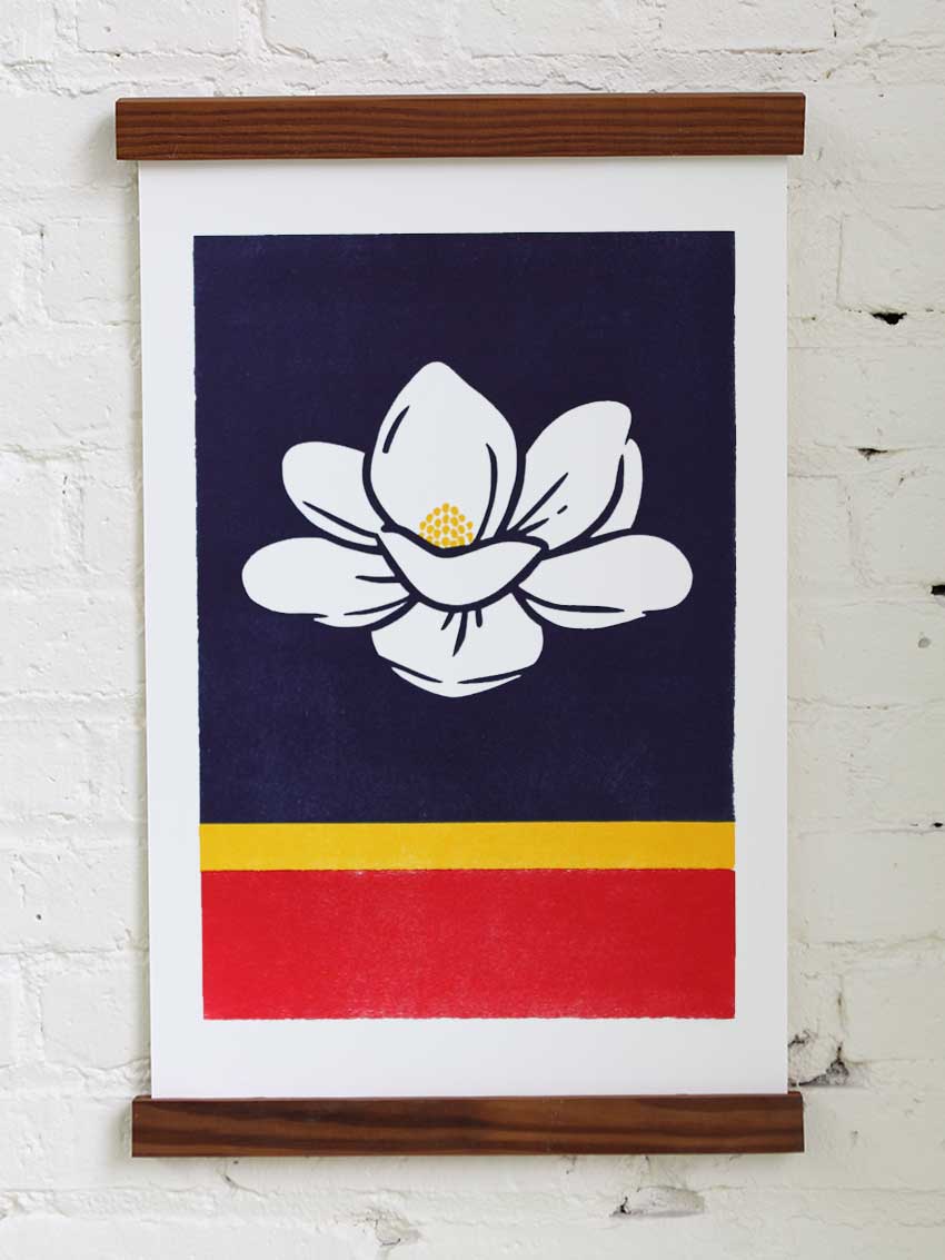
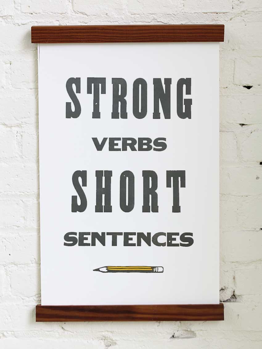
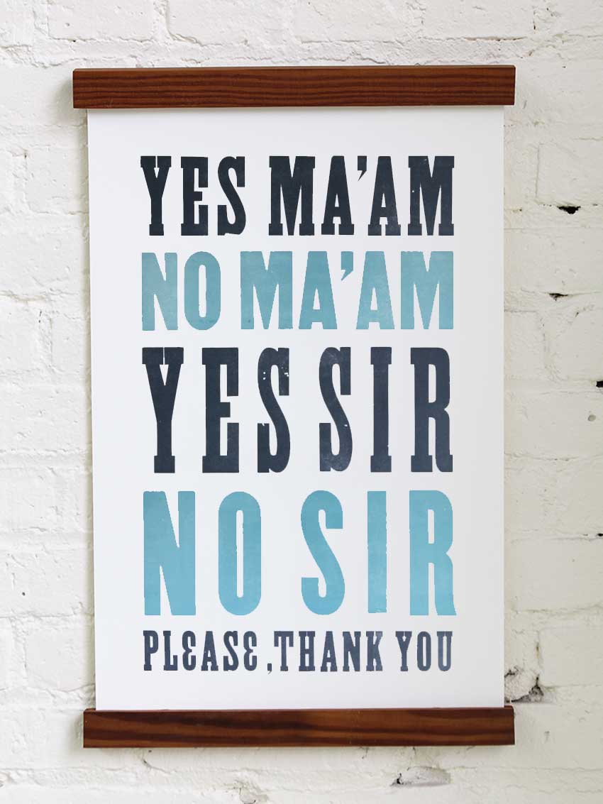
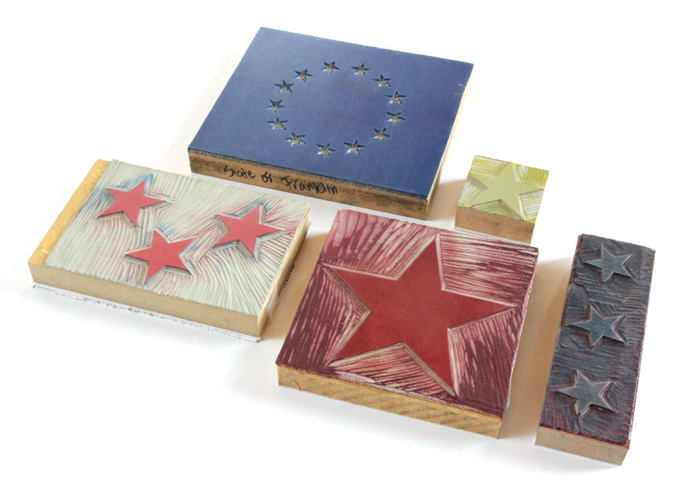
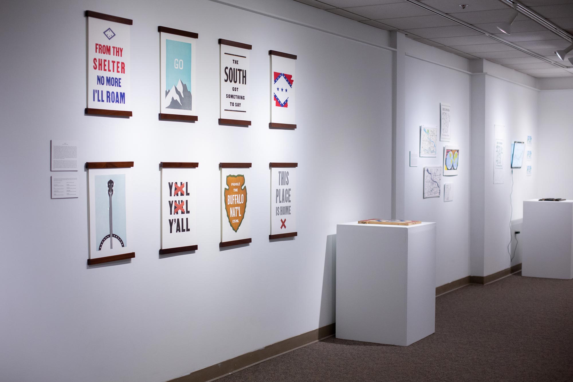
We designed over 250 letterpress prints, printed from a large collection of orignial woodblock letters and hard-carved linoleum blocks.




Product Line Extensions
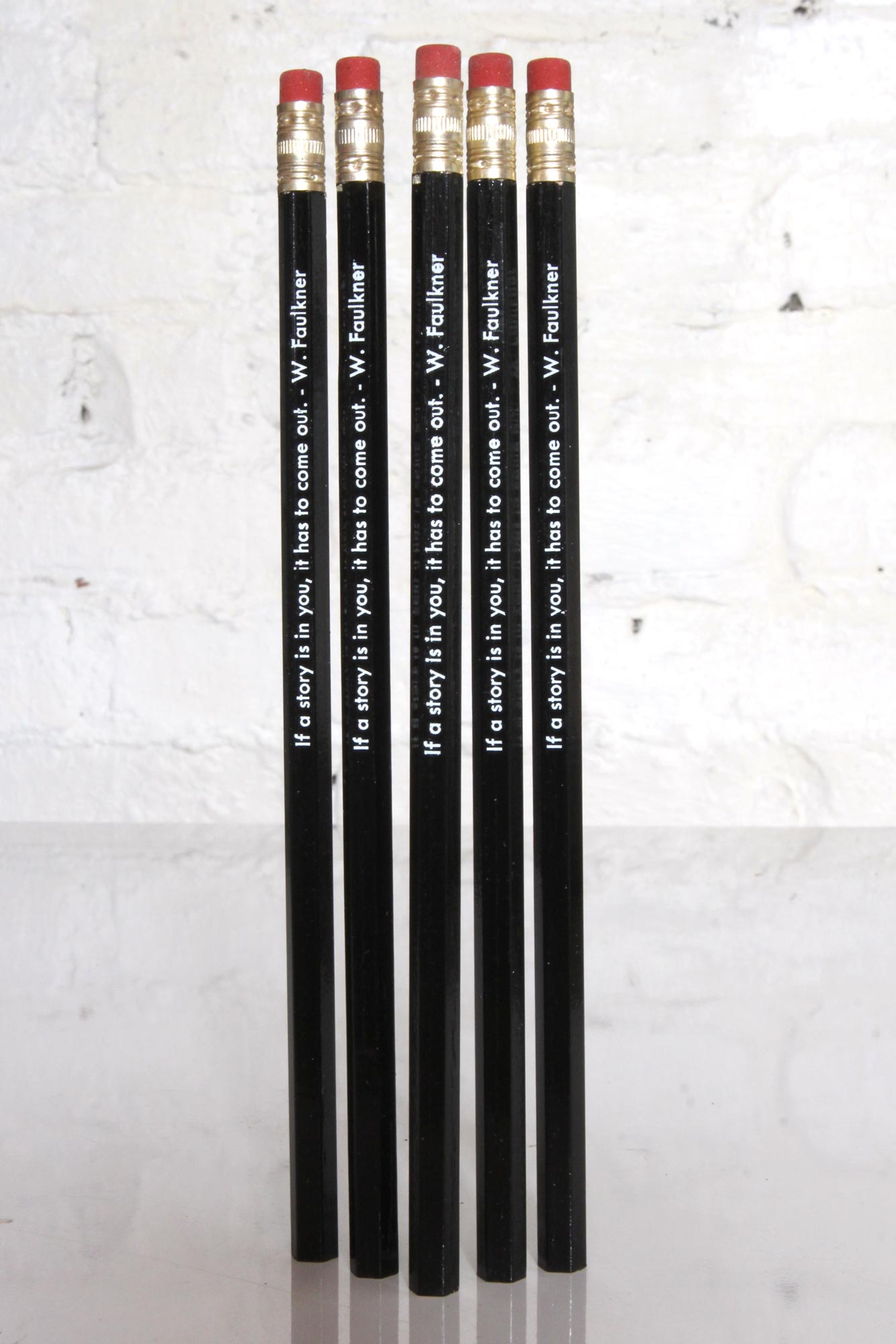
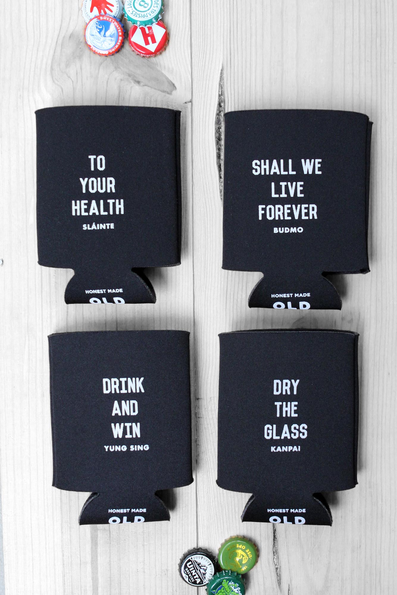
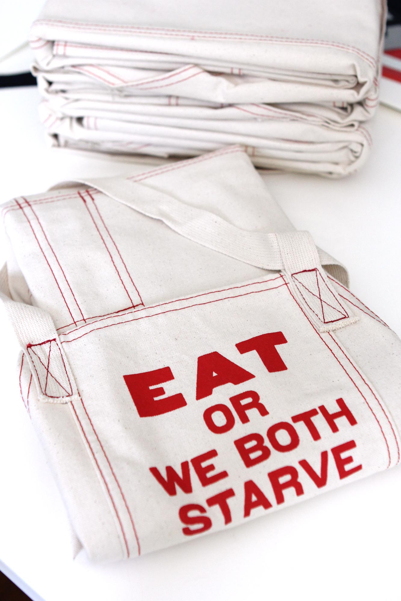
A few of our collaborations and extensions.




▞▞▞
Circle & Square
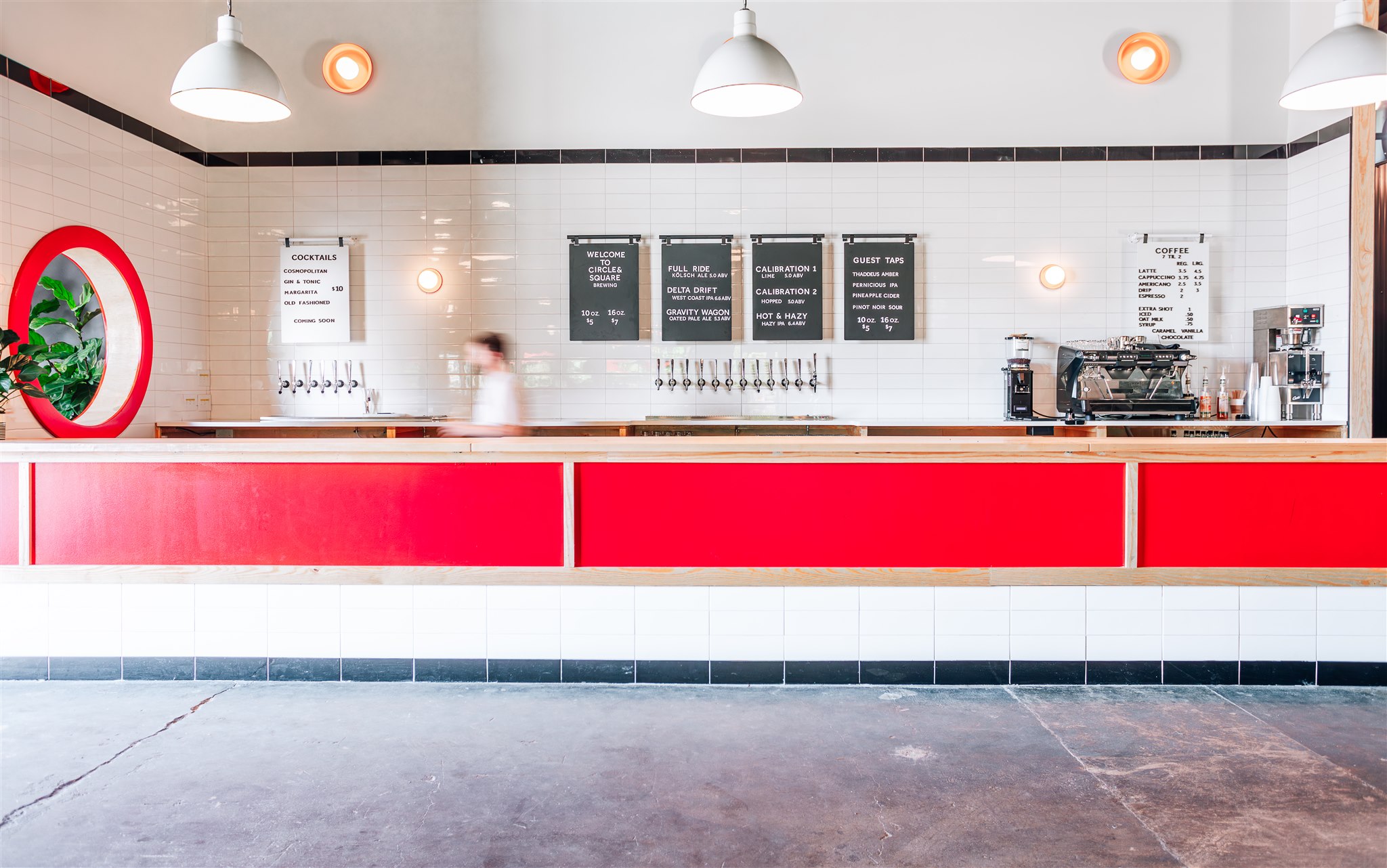
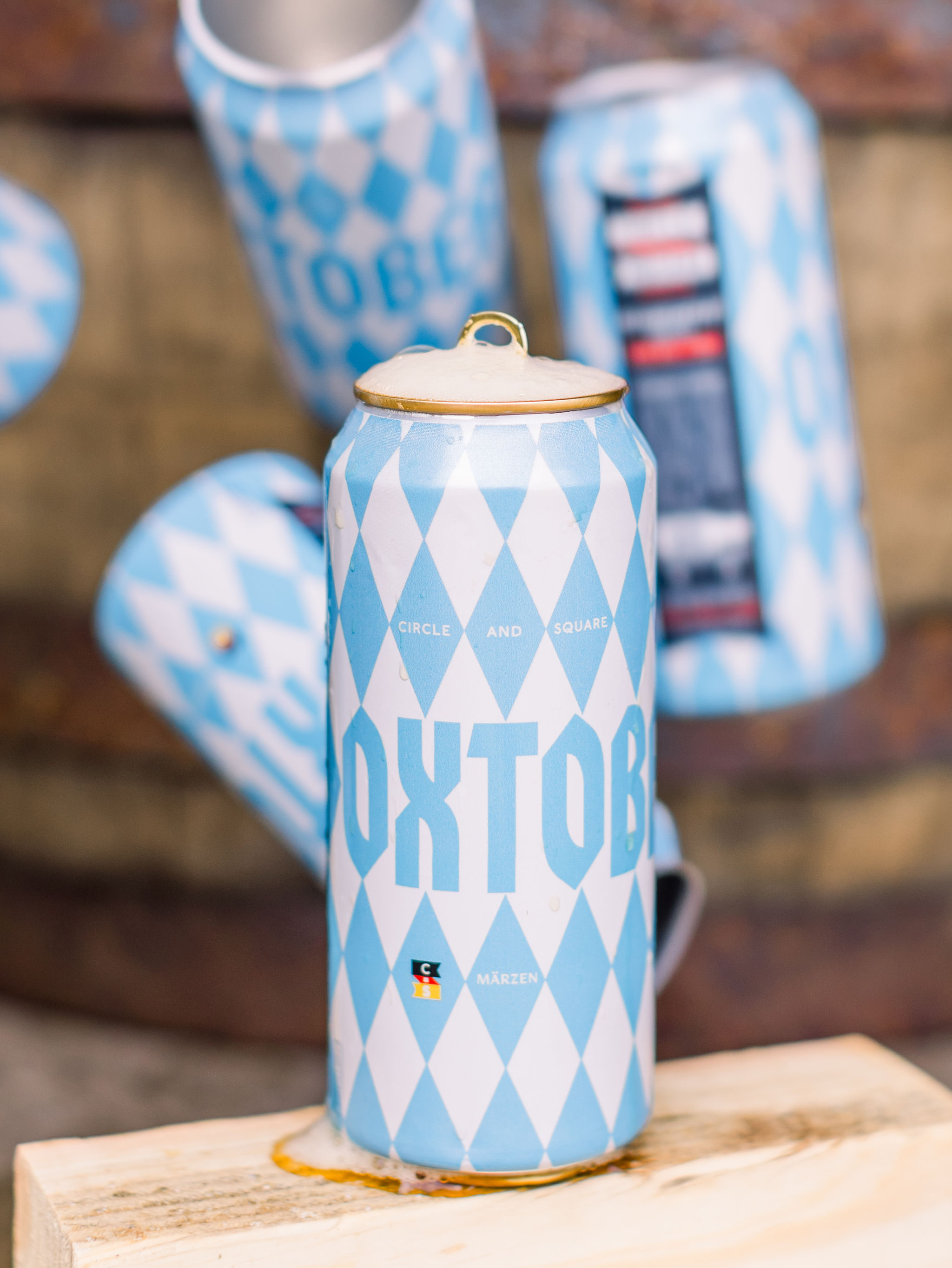
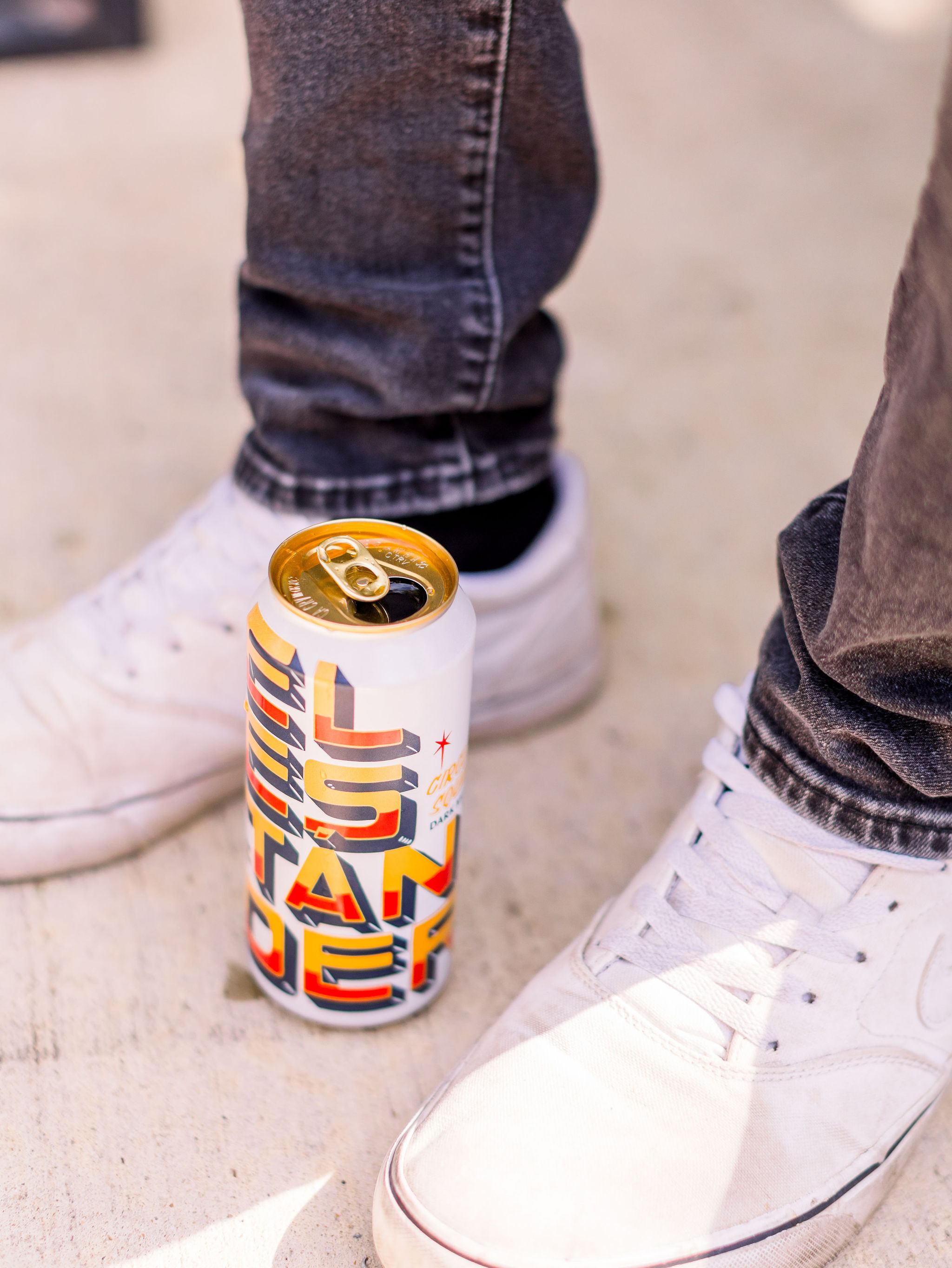
In 2021, a group of founders approached Villager to establish the brand for Oxford’s first microbrewery. We’ve been activetly engaged since that time.
In 2021, a group of founders approached Villager to establish the brand for Oxford’s first microbrewery. We’ve been activetly engaged since that time.
Oxford, Miss.
2021 - Present
Inspiration
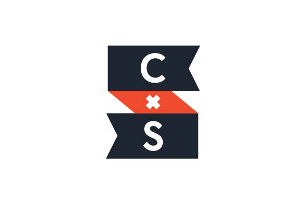
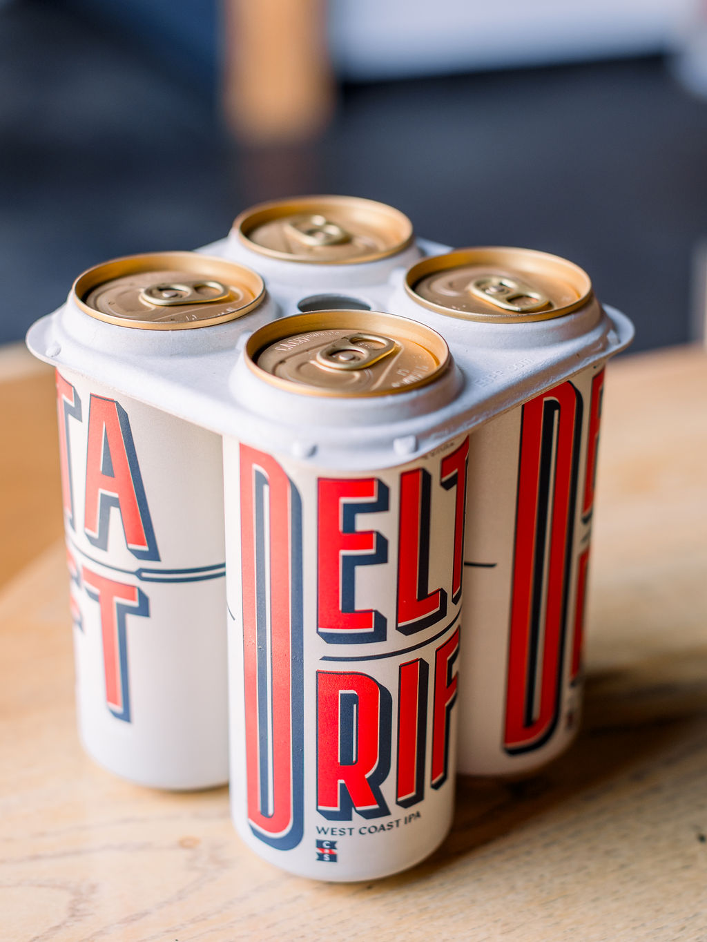
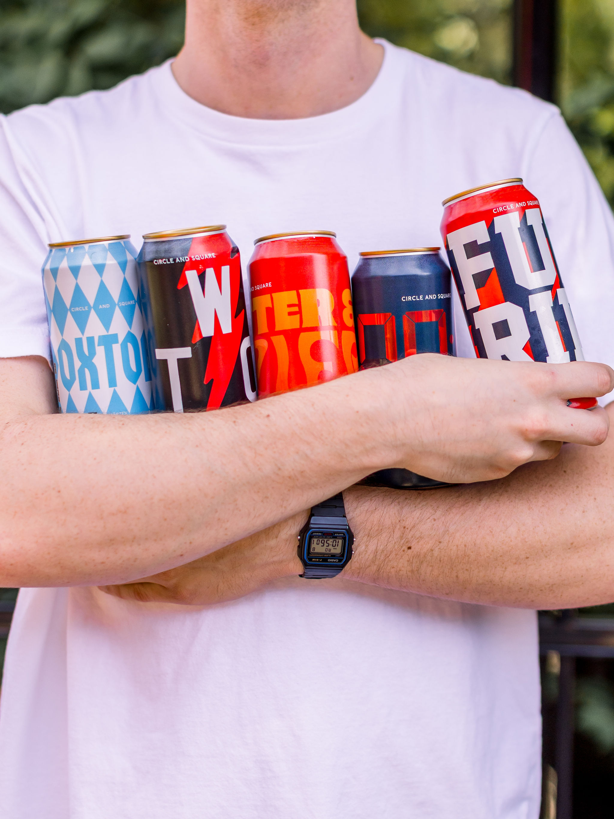
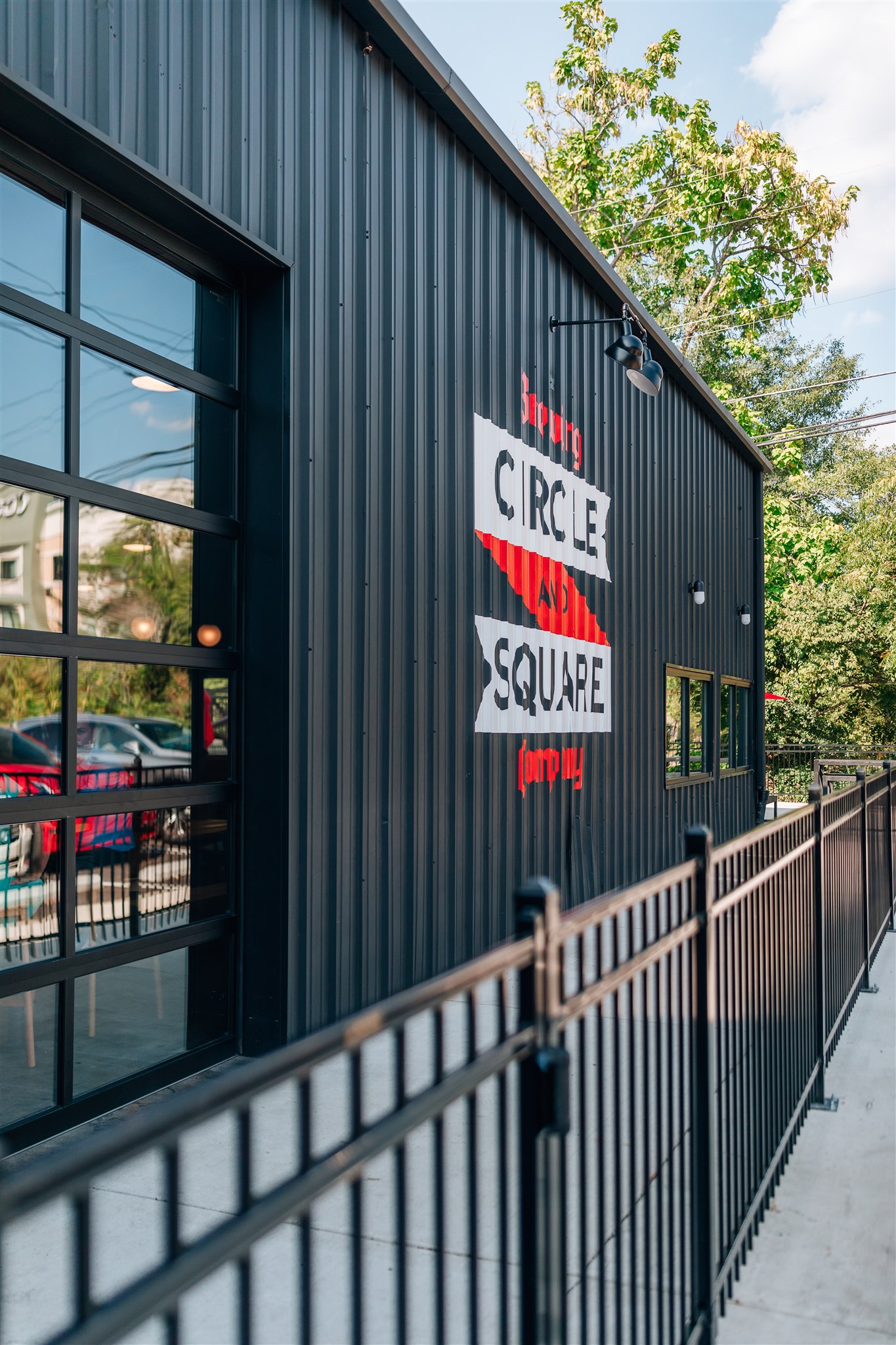
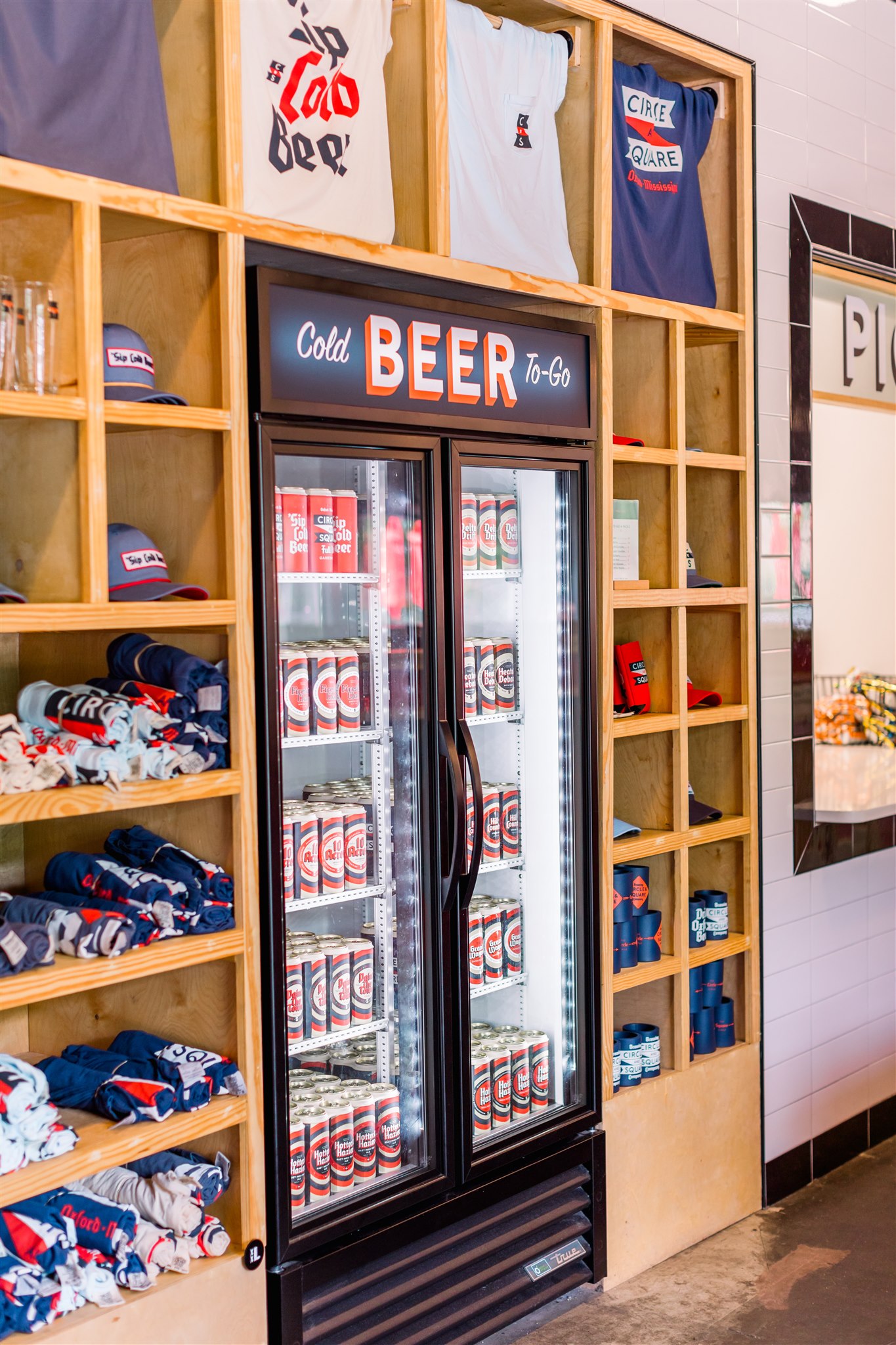
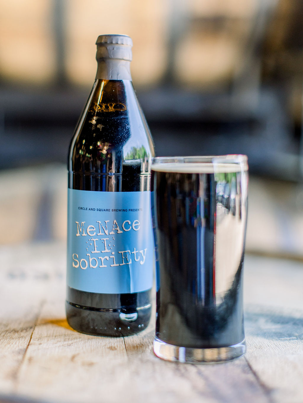
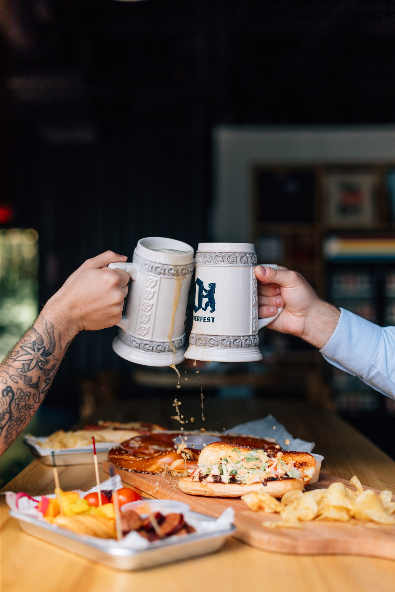
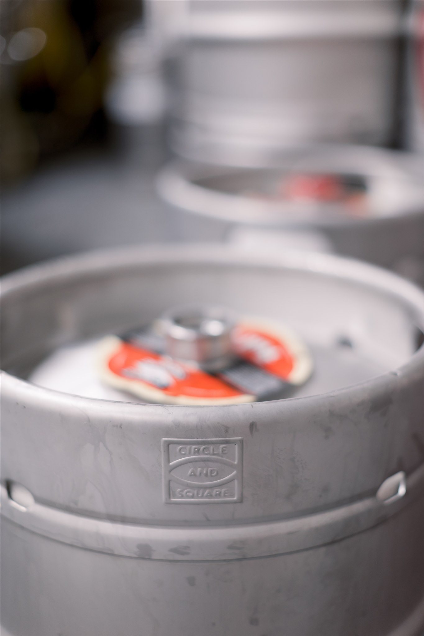
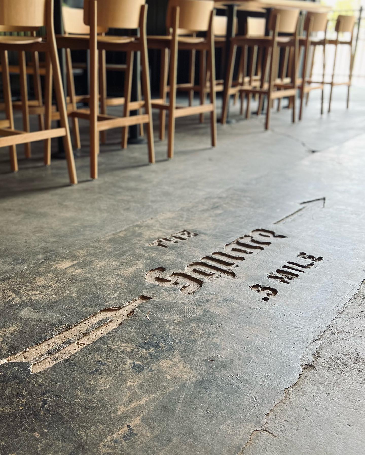
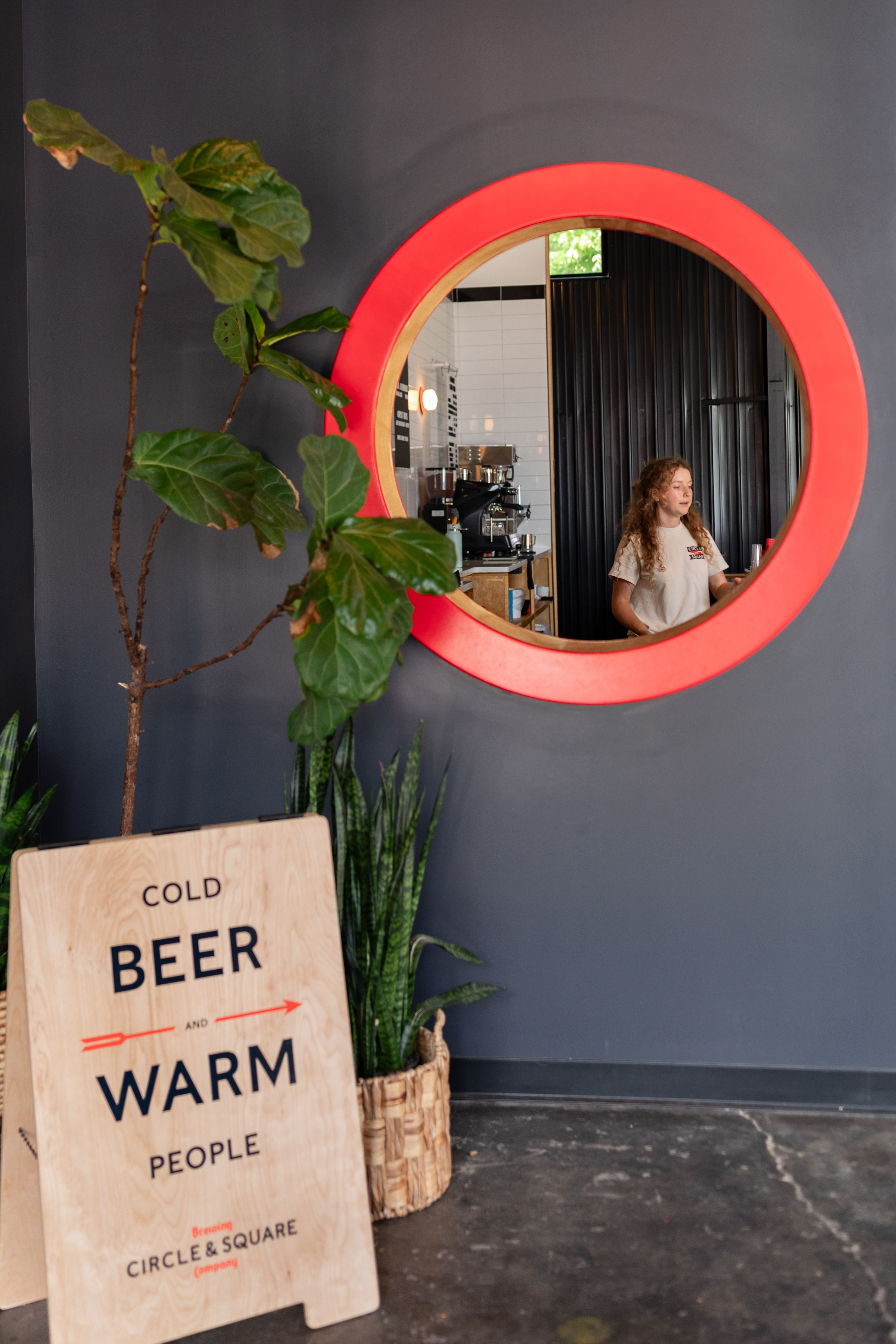
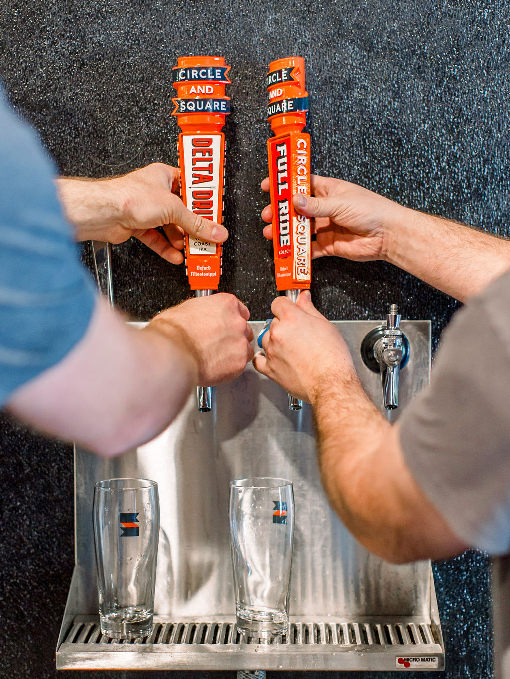
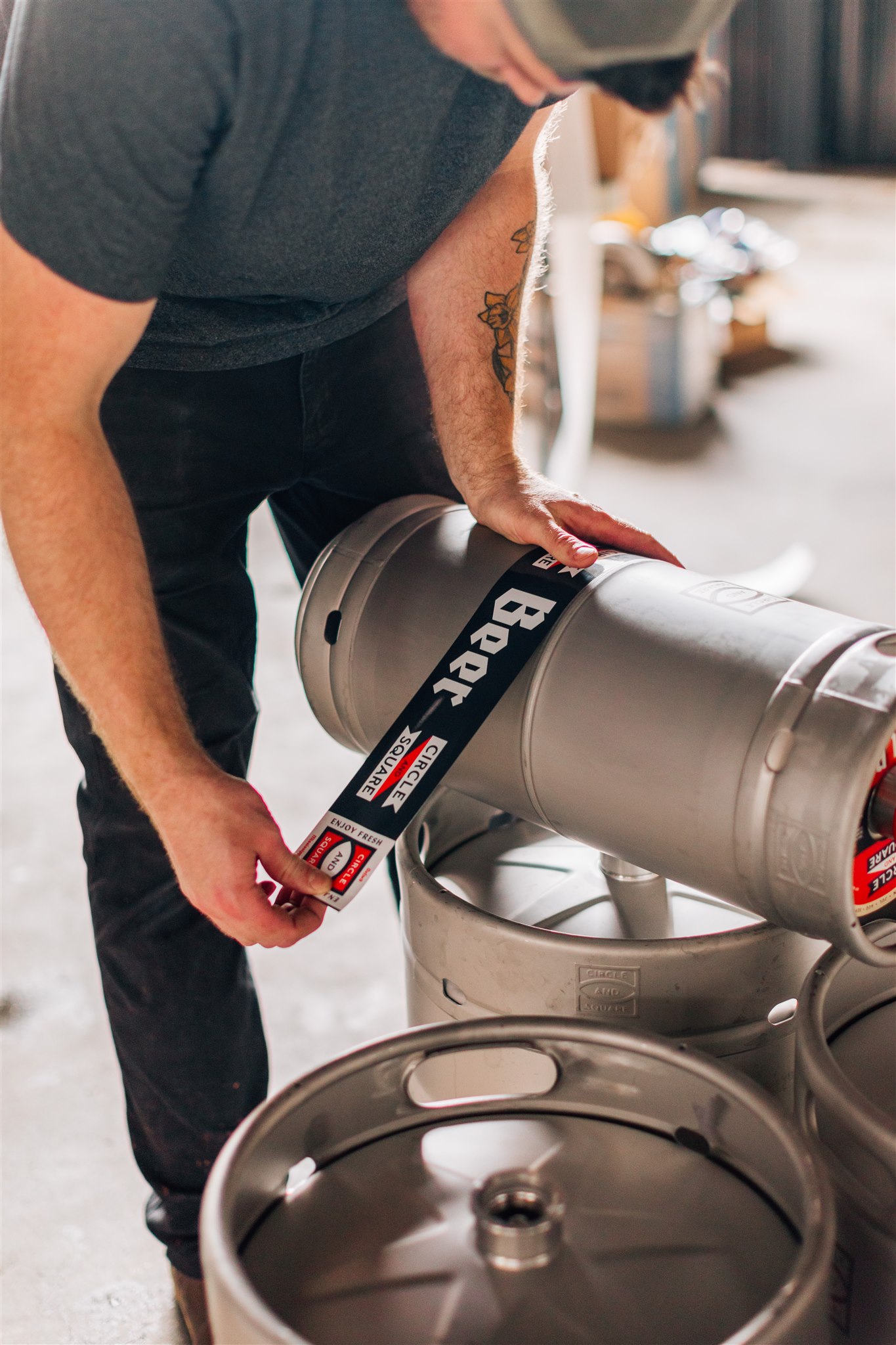
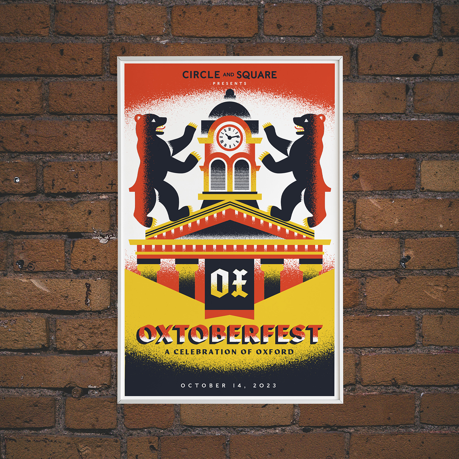
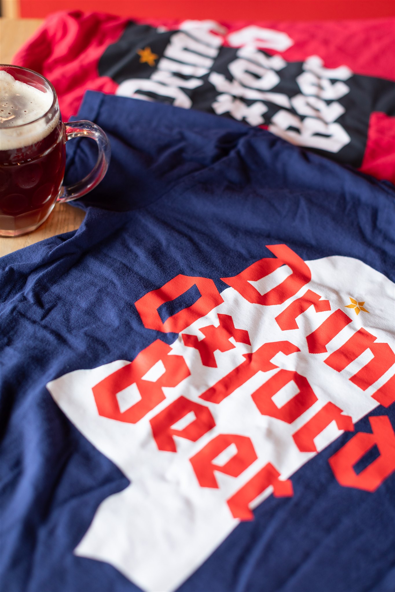
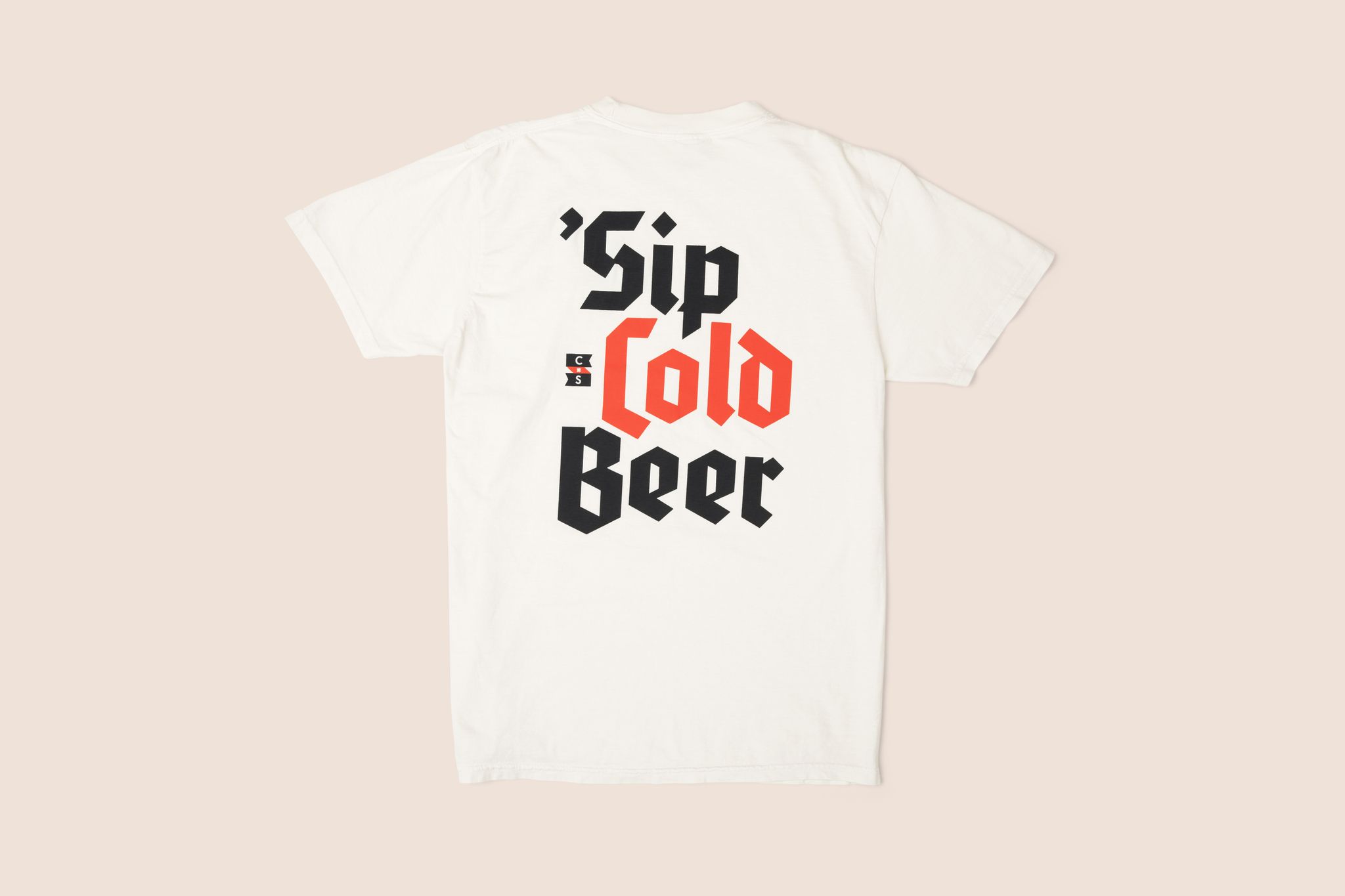
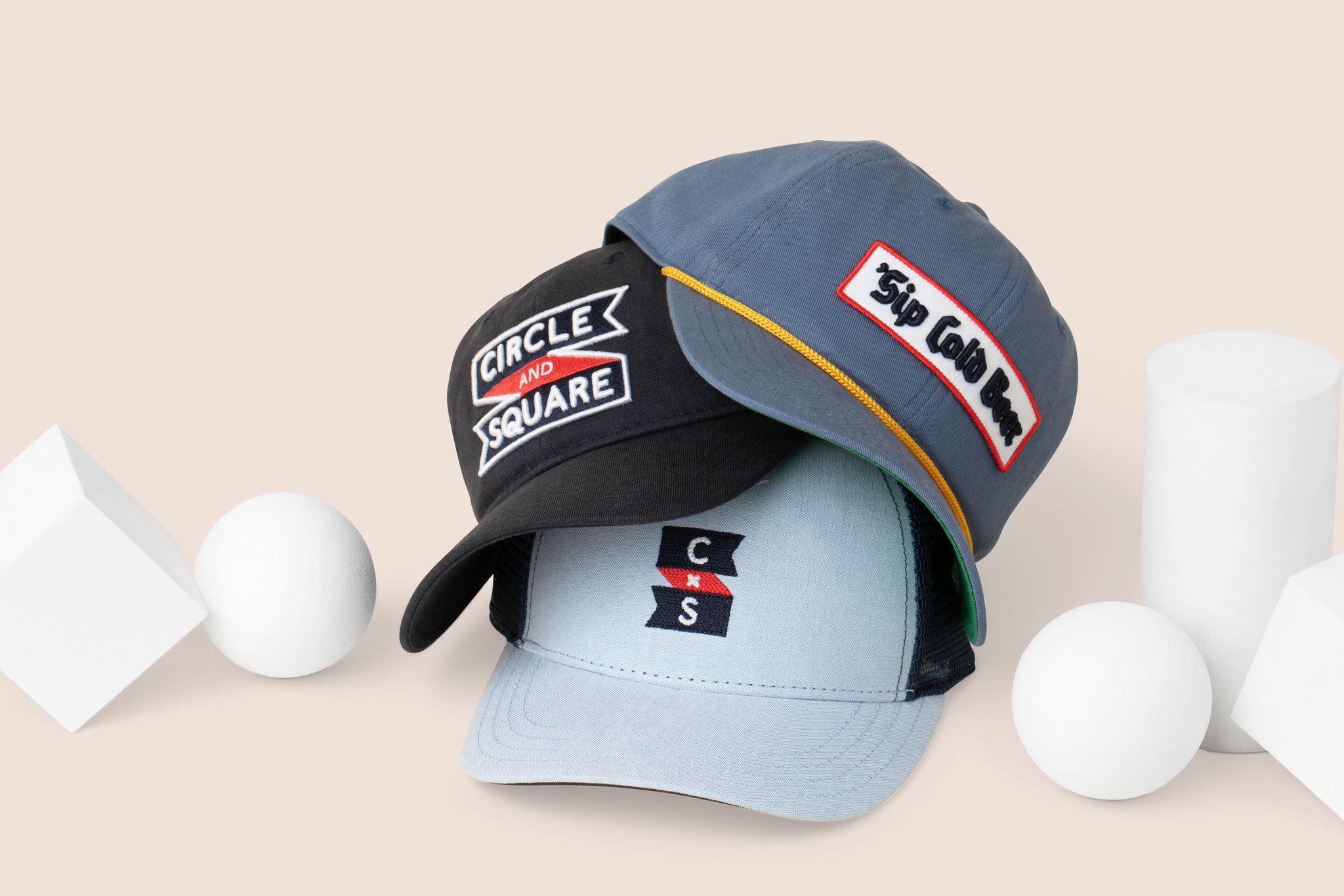
The brewery sits beside the original train depot. we leaned into transit history - the Gill inspired rounded type from British subways (a nod to Oxford’s namesake), and the swallowtails from railroad signage. The blackletter from Geramic beer halls is a sharp contrast.

Merchandise
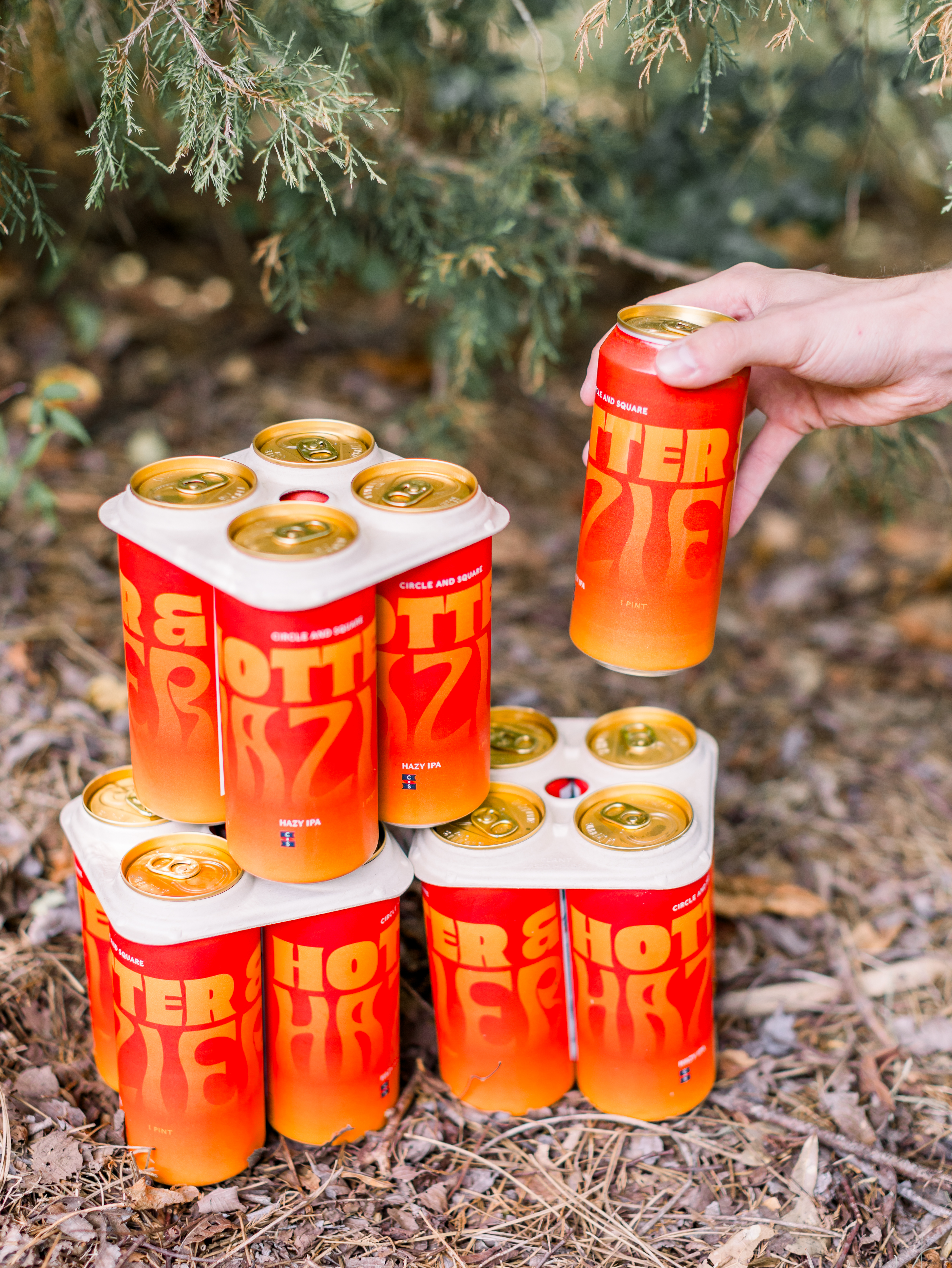
We’ve designed over 50 SKUs, and can’t keep them in stock.




A mascot
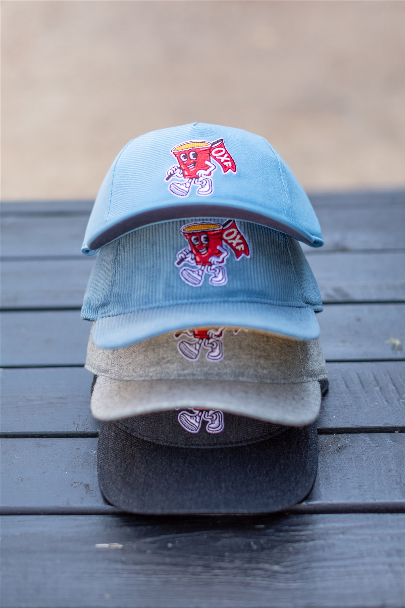
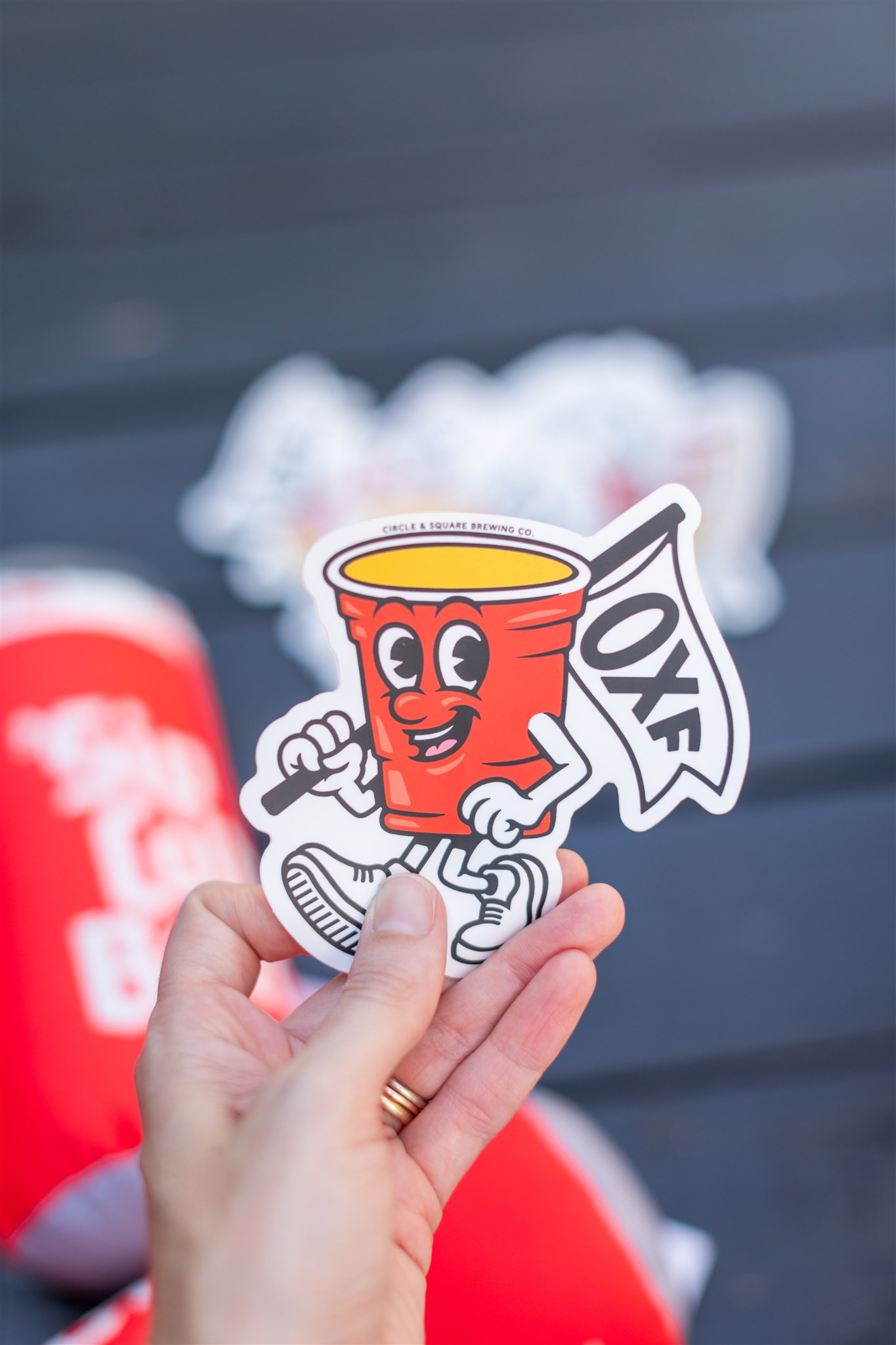
The university next, Ole Miss, doesn’t have a mascot. But they do have a law that beer isn’t allowed on campus. But if the beer is in a red cup, the fuzz will leave you be. We designed a new mascot for the town named Sparky, after the legendary Dean of Students. It has gone over like gangbusters.
▞▞▞
Accidental
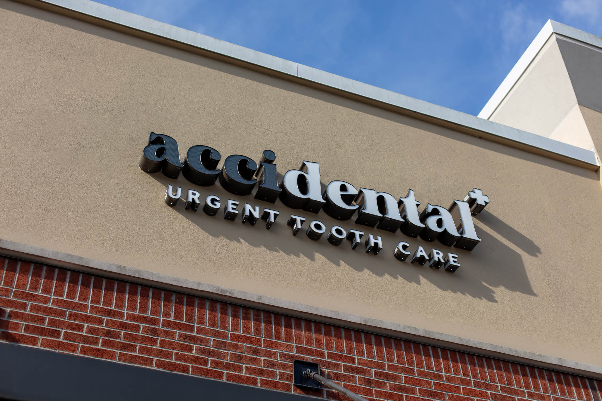
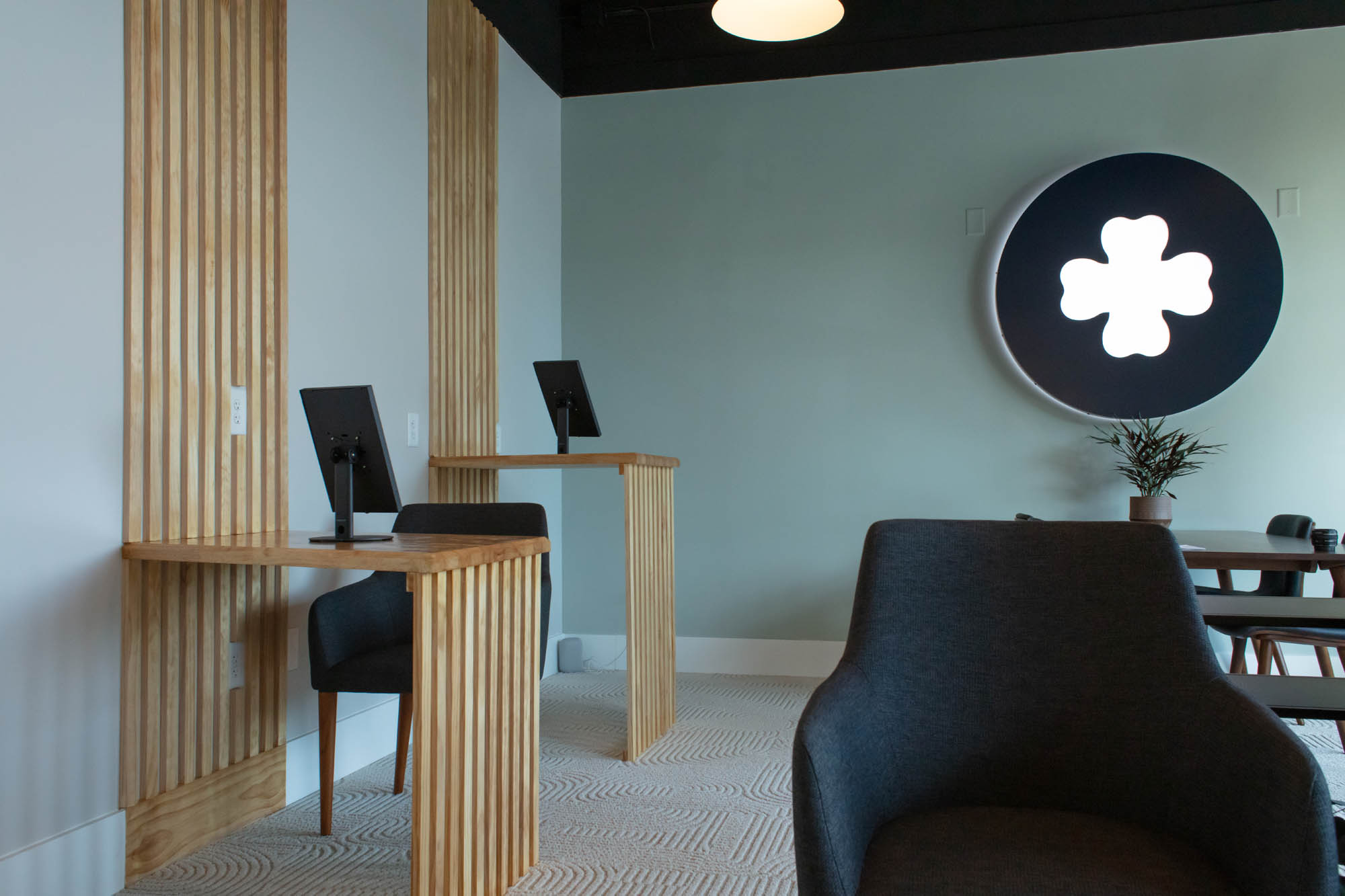
Two dentists came to me with an challenge: a dental clinic, but for urgent care. A clean transaction - no six month cleanings, no long term relationships. A place for life’s oops and oh damns. This is what we cooked up.
Two dentists came to me with an challenge: a dental clinic, but for urgent care. A clean transaction - no six month cleanings, no long term relationships. A place for life’s oops and oh damns. This is what we cooked up.
Chapel Hill, NC
2024 - Present

What’s in a name?
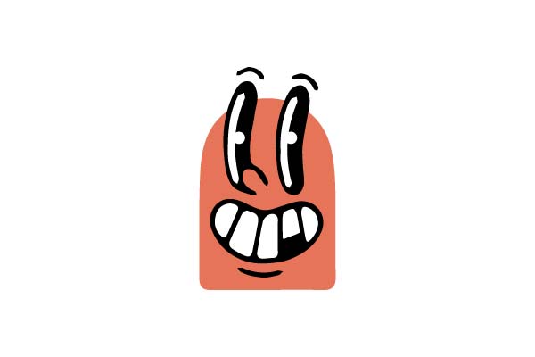
We wanted to create a name that said it all. Ouch Mouth was a no go (we tried). So once we cracked (and trademarked) accidental, we made OuchMouth the mascot. He’s on busses all over town.



▞▞▞
Whitt’s Barbecue
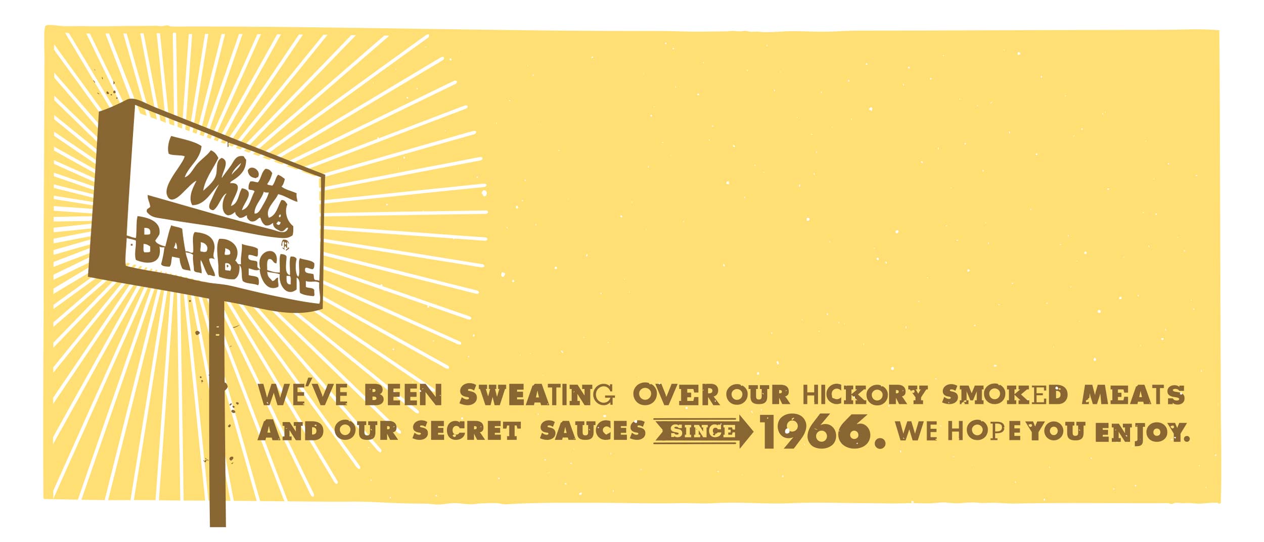
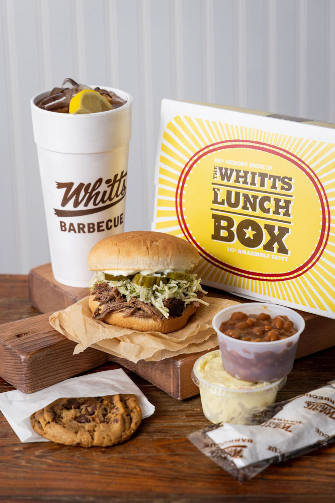
A fifty plus year old barbecue institution needed some design help. Having grown up on the stuff, and working there one summer in college,we were excited to help out. And the design still looks pretty great with fifteen years of wear on it.
A fifty plus year old barbecue institution needed some design help. Having grown up on the stuff, and working there one summer in college,we were excited to help out. And the design still looks pretty great with fifteen years of wear on it.
Decatur, Ala.
2007- Present
Services
Bottle labels
Box design
Out of home
Merchandise
Bottle labels
Box design
Out of home
Merchandise

Inspiration
Hatch Show Print, baby! One of the Whitt’s went to Vanderbilt, and we’d often go up to Nashville to visit (and to Opryland). We wanted to channel that vibe as it felt right.
Execution Notes
To stay true to letterpress show print, each letter was hand set. Photography and styling by Abraham Rowe.





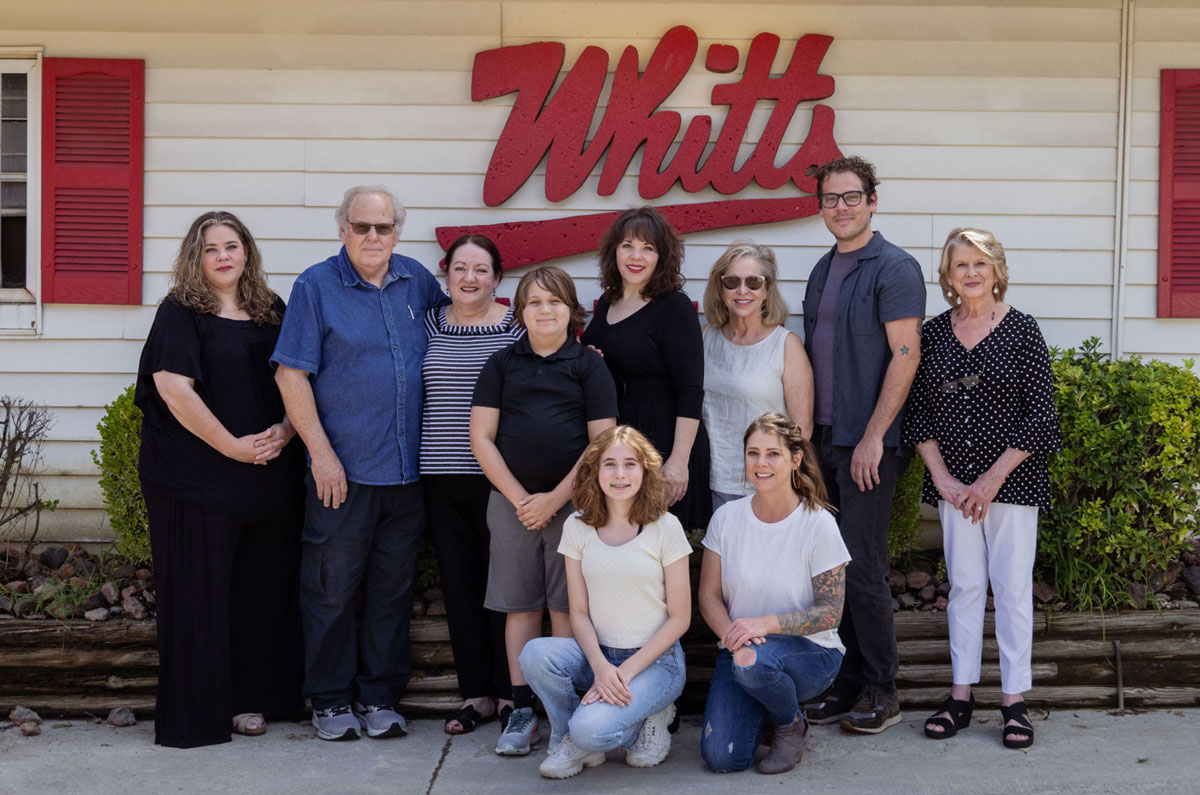
☝🏻 Love these people with all my ❤️
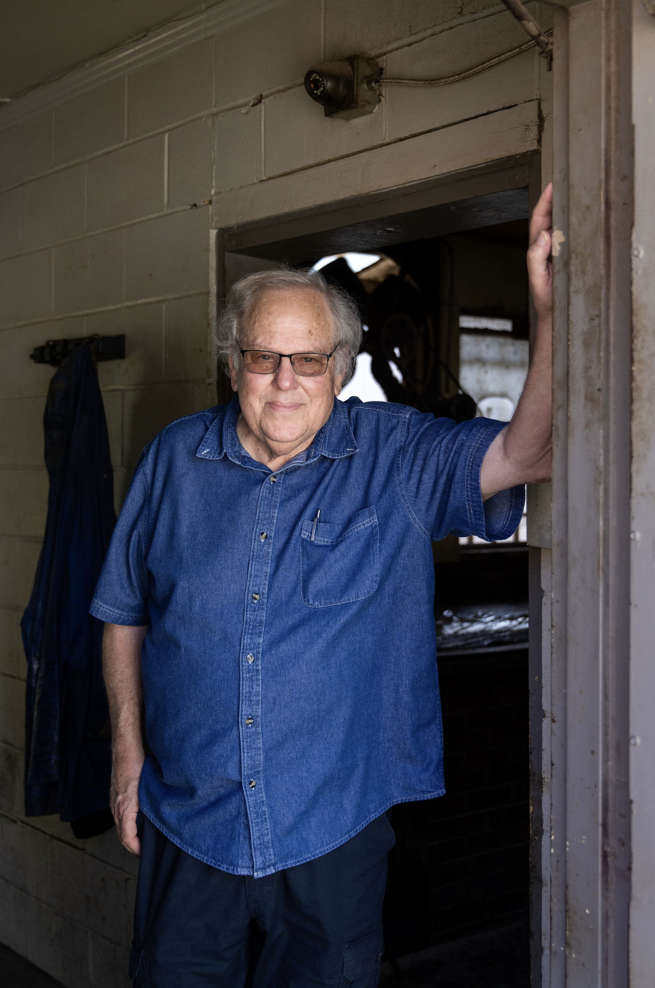
Mark Whitt, President
In all the almost 60 years that we’ve been in business, the best thing I ever did was to call Micah! From our now famous Lunch Box design to our gift cards to our poster designs, just to name a few, Micah gave our business a long term shot in the arm. We call him “The Design Genius”. I really think he is also a “BBQ Genius “
▞▞▞
The Alabama Biscuit Company
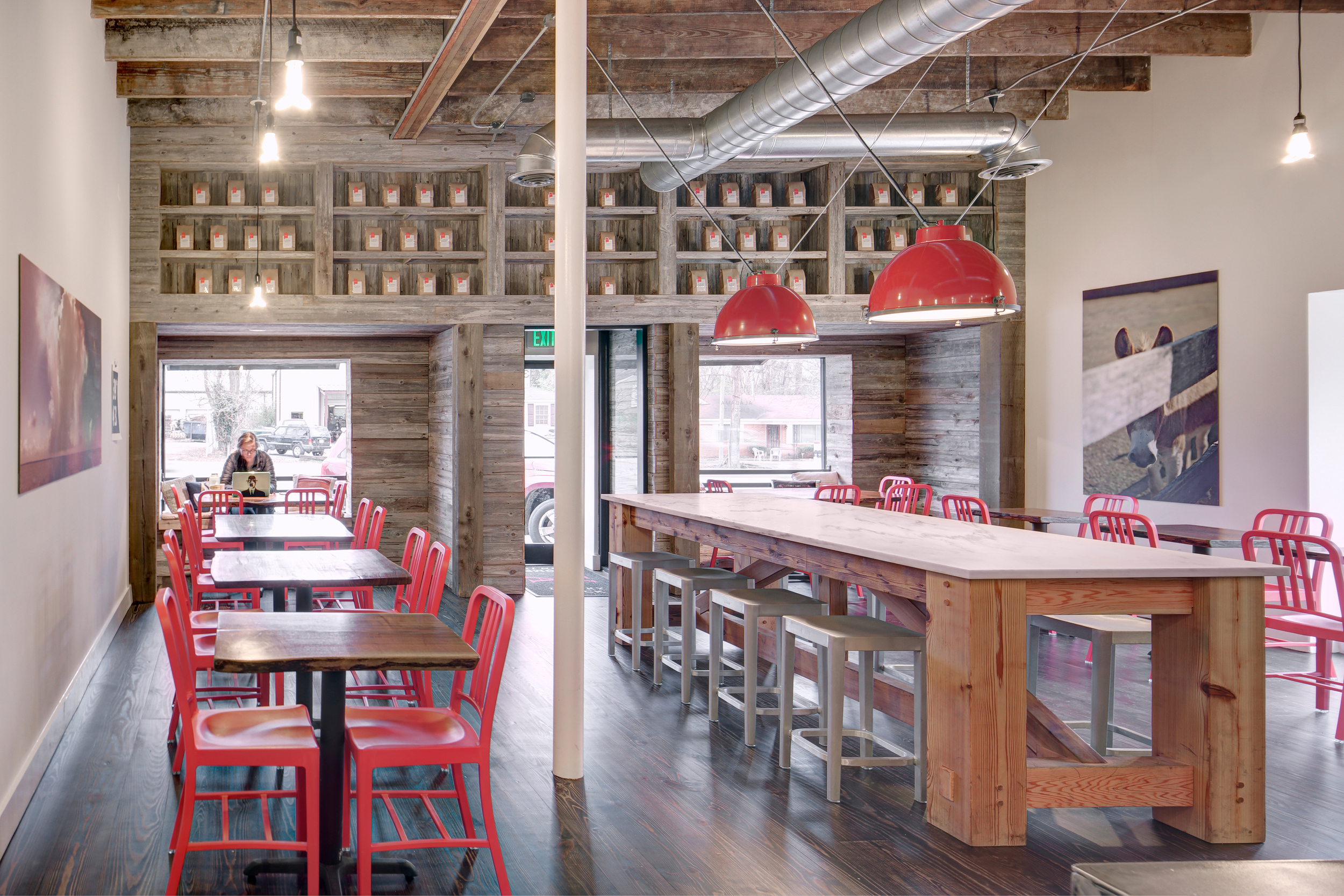
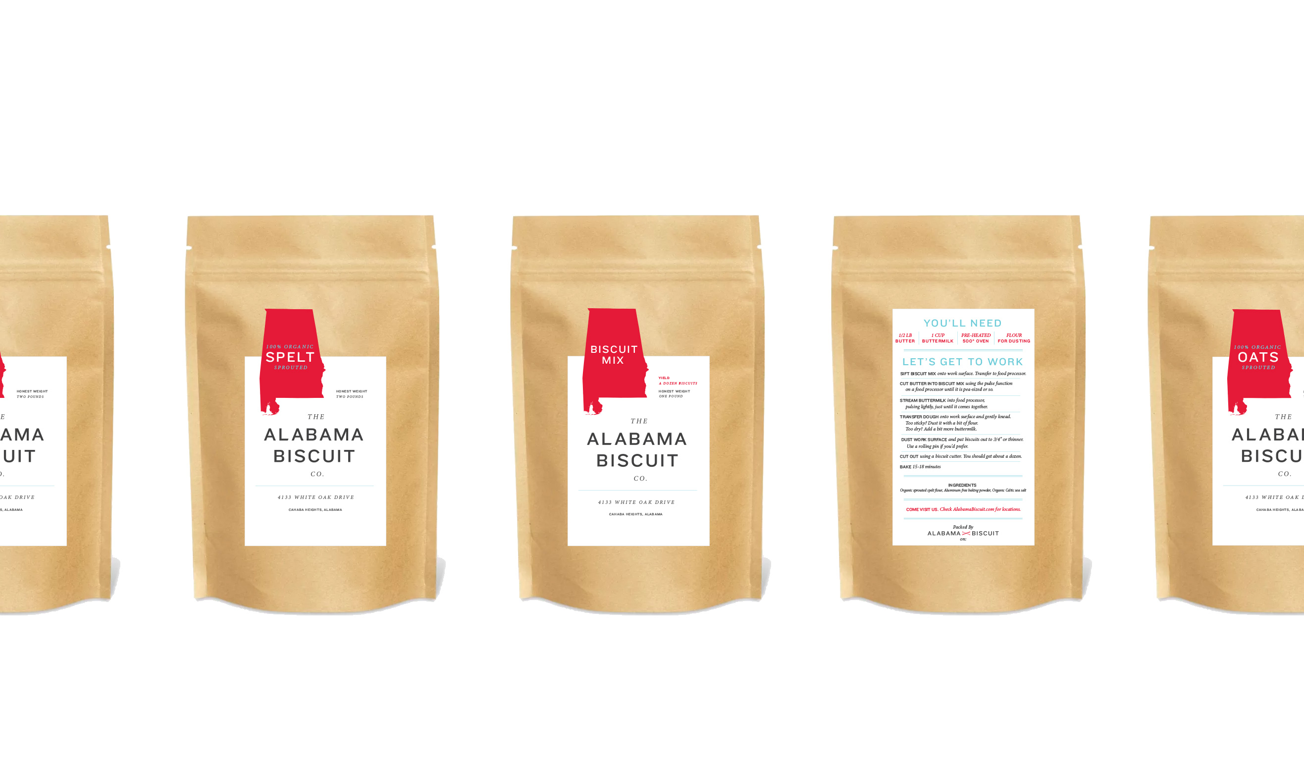
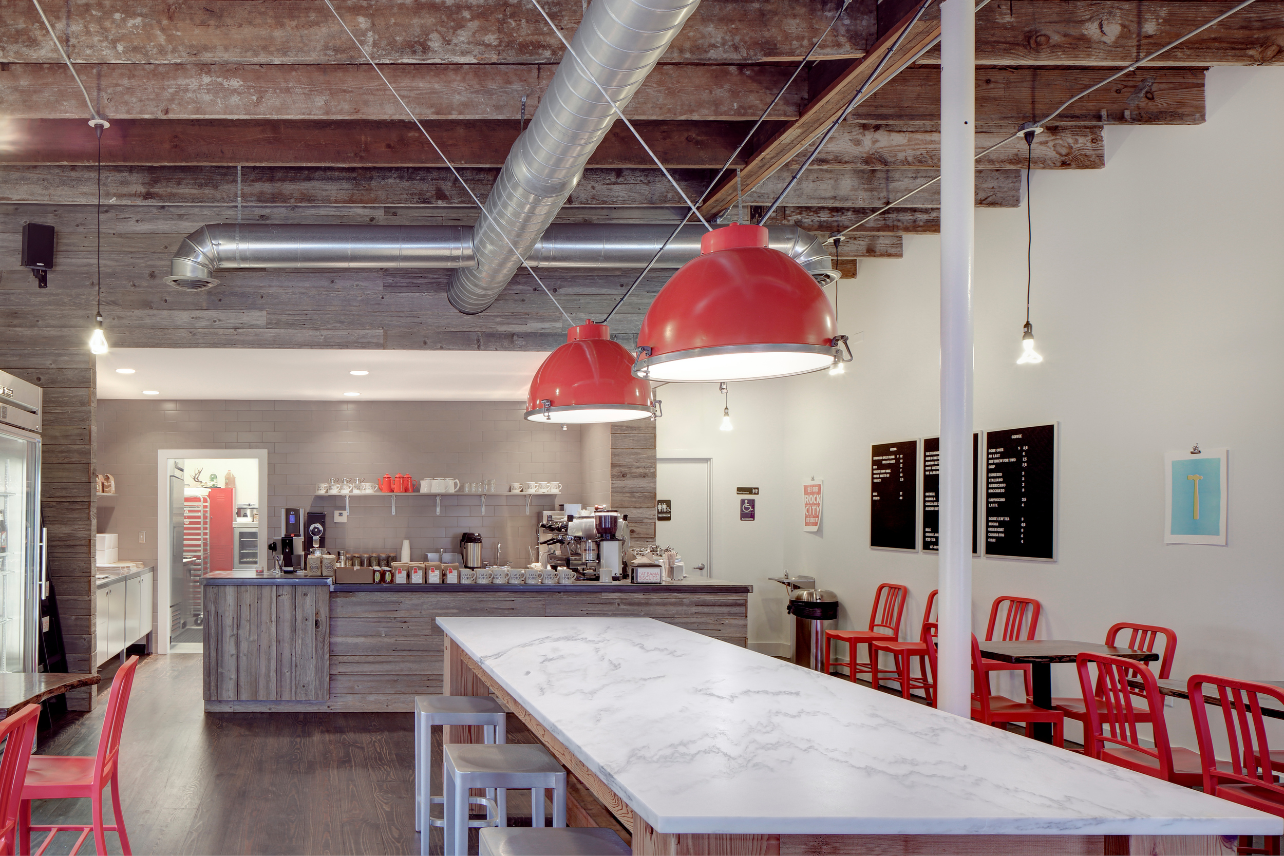
Jonathan Burch didn’t set out to change the biscuit game. He was just looking for healthy biscuits made from local sprouted grains for his growing family. When he couldn’t find any, he decided to put his landscape business on hold and try it out. Launched in 2013, Alabama Biscuit has become a Cahaba Heights favorite with multiple locations throughout Birmingham.
Jonathan Burch didn’t set out to change the biscuit game. He was just looking for healthy biscuits made from local sprouted grains for his growing family. When he couldn’t find any, he decided to put his landscape business on hold and try it out. Launched in 2013, Alabama Biscuit has become a Cahaba Heights favorite with multiple locations throughout Birmingham.
Birmingham, Ala.
2013 - Present


Inspiration
The flag of the State of Alabama shall be a crimson cross of St. Andrew on a field of white. The bars forming the cross shall be not less than six inches broad, and must extend diagonally across the flag from side to side.
Code 1896, §3751; Code 1907, §2058; Code 1923, §2995; Code 1940, T. 55, §5.



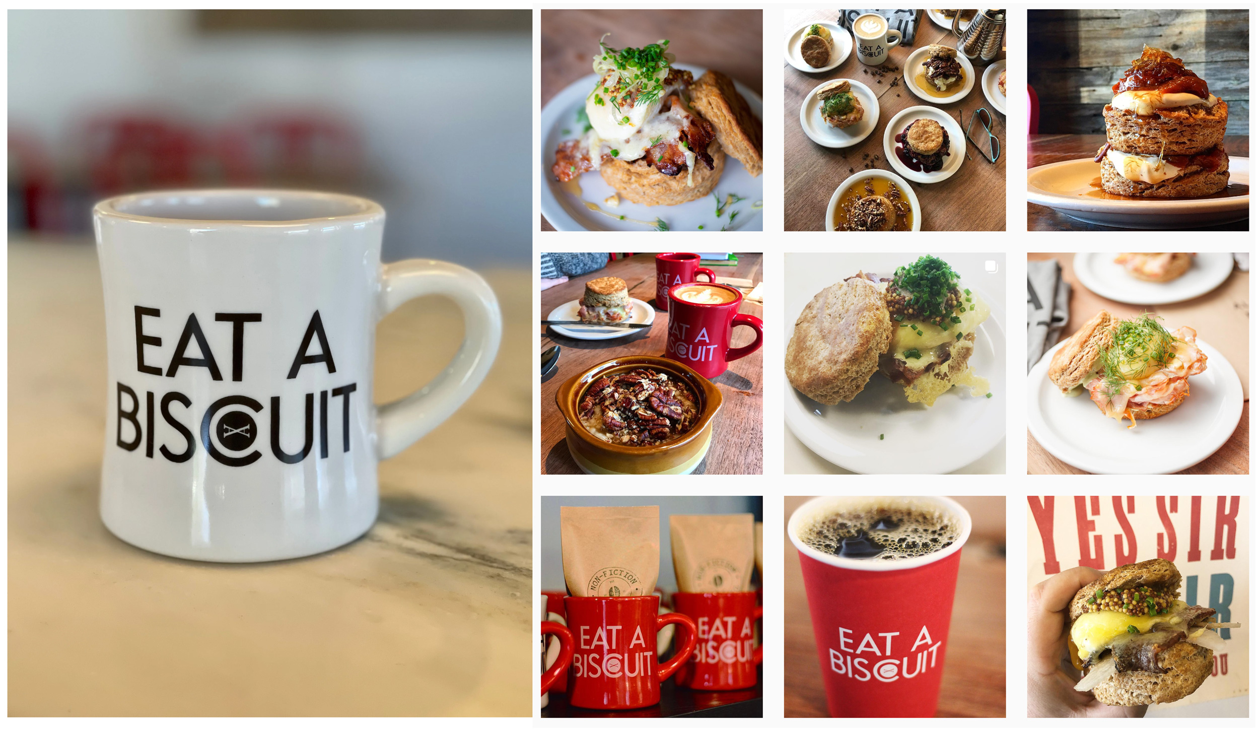
Mug Shots
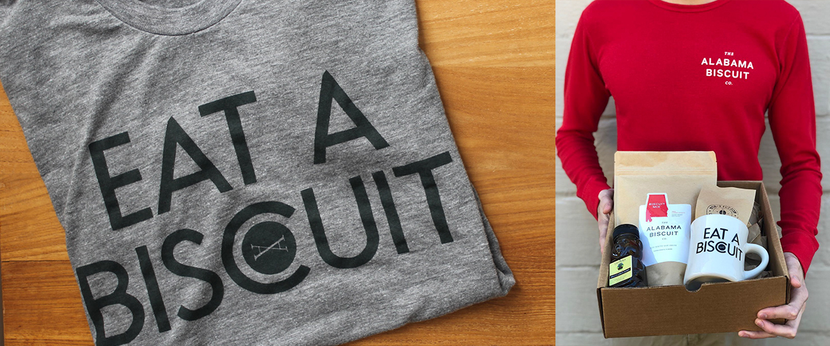
I had a hunch folks would want something to share in the social space. Something simple. Something that said “Yeah, I eat good things at cool places. And those things usually have caffeine riding in a side car.” So we made this mug. Low and behold, the mug shows up in ~65% of social posts about the Biscuit Company.
A final word from the client:
Watching Micah do design things is like watching Eric Liddell run in Chariots of Fire. A rare blend of humility and confidence leading to a finesse which can only be described as the real deal.
He’s done several projects for me and always under promises and over delivers.
He’s done several projects for me and always under promises and over delivers.
▞▞▞